5 WordPress Web Design Trends for December 2022
Before 2022 comes to an end, we have one more collection of WordPress web design trends to share. Use these ideas as inspiration leading into the new year. Here are five great trends to consider this month: 1. Rotating Animation There's almost no better animation style than realistic motion.

Before 2022 comes to an end, we have one more collection of WordPress web design trends to share. Use these ideas as inspiration leading into the new year.
Here are five great trends to consider this month:
1. Rotating Animation
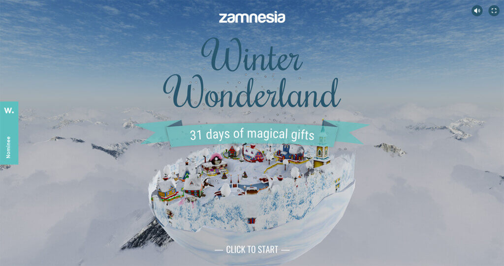
There’s almost no better animation style than realistic motion. Rotating animations can create a 360-degree view of a product or scene to help draw users into the design element.
The thing that sets a great animation apart from everything else is the motion itself. The right flow and speed make a huge difference in this example from Zamnesia.
2. Fixed Navigation Layer
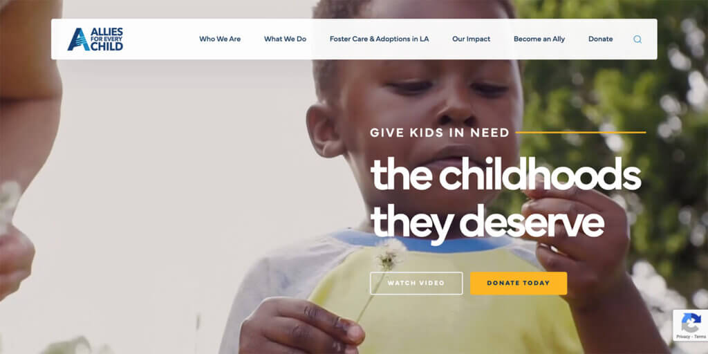
Layered design elements have been trending for a while. This new twist on layers pops the main navigation menu into an element that is on top of a background video or image. Just check out this example from Allies for Every Child.
What’s different than traditional navigation is that the container isn’t full-width. It floats in the center of the screen without touching the top edge or side edges of the browser window. This can help set navigation out as more of a design element with more attention to it.
Another bonus to this design style is that the navigation can be put in a white or light box easily for optimal readability.
3. Minimal White
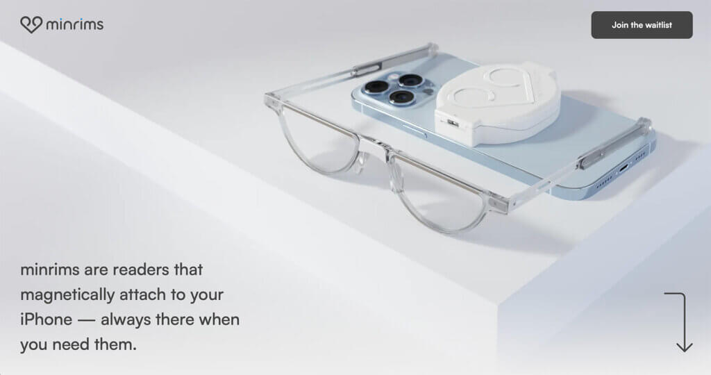
Another trend that has staying power is minimalism. The next twist is a white or light everything in a minimalist design scheme. Minrims demonstrates this perfectly.
This can be an elegant and beautiful option that works for anything from portfolio websites to product sales. A white or light design also creates the opportunity for a lot of contrast with text elements that make them exceptionally easy to read and understand.
4. Overlapping Layers
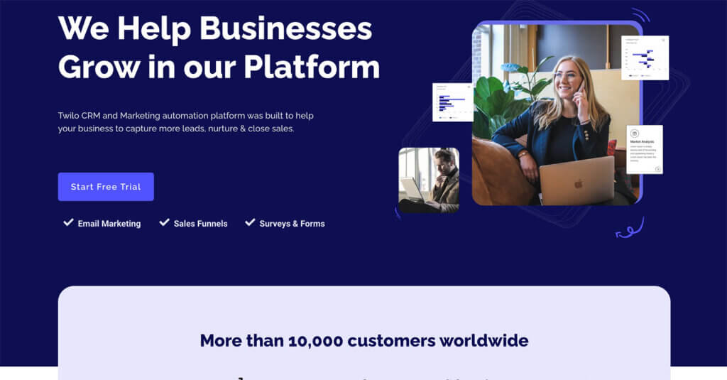
Overlapping layers help create interest and encourage scrolling because you can see a glimpse of what’s to come on each “screen” in the design. Twilo provides a great example of this.
This design trend works best when there is ample space between layers so that everything is easy to see and read while creating the opportunity to continue scroll actions. Generally, you get panels with alternating large and small horizontal elements, so there’s always something else to see on the scroll.
5. Unusual Sliders
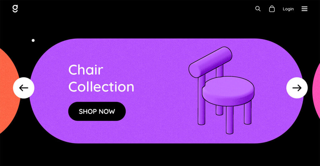
Sliders have been a part of website design projects for a while, with the primary visual being a large photo with a text element. That trend is moving to another level with more unusual slider designs that encourage that same left and right interaction but with a more dynamic look and feel.
Dopegood does that here in the design with pill-shaped monotone colors that move left and right. It’s all on a black background that removed the “square” feel that many slider designs seem to have. It’s a creative and out-of-the-box solution!
Putting it All Together
WordPress web design trends are a fun element but don’t feel like you have to try every new trend that comes along. Pick the ones that are right for your website and brand to keep it feeling fresh and modern.
Join us for the next Solid Academy Webinar!
Free weekly webinars that will help you master WordPress and increase your business's bottom line.
What is a WordPress Phishing Attack?
Learn how to identify and prevent phishing attacks on WordPress websites.
Kiki SheldonWebsite Protection: 5 Ways to Keep Your Website Safe
Robust website protection is the shield that stands between your business and relentless cyber attacks. Prioritizing website protection enables businesses to fortify defenses to safeguard their online presence and preserve the trust of their customers in the face of ever-evolving cybersecurity threats.
Kiki Sheldon23 Ideas To Grow Your WordPress Business in 2023
WordPress is the most popular website-building platform worldwide, trusted by numerous brands. WordPress enables you to build a user-friendly and highly reliable site, together with tools and plugins to enhance your marketing and work like a lead magnet. All these features make WordPress the platform chosen by more than 43% of businesses globally.
SolidWP Editorial TeamSign up now — Get SolidWP updates and valuable content straight to your inbox
Sign up
Get started with confidence — risk free, guaranteed

