Call to Action: The Ultimate Guide to CTA
As you explore the web, you probably come across hundreds of buttons urging you to take an action, such as purchasing that new t-shirt you've been wanting or signing up for email subscriptions for quick news notifications. These buttons are typically referred to as call to action or CTA buttons in the realm of online marketing.

As you explore the web, you probably come across hundreds of buttons urging you to take an action, such as purchasing that new t-shirt you’ve been wanting or signing up for email subscriptions for quick news notifications. These buttons are typically referred to as call to action or CTA buttons in the realm of online marketing.
Want call to action buttons on your website that are impossible to miss but still clickable? In this guide, we’ll cover everything there is to know about call to action, or CTA. We’ll cover some CTA examples, tips, best practices, and more. So are you ready to “Learn More?” Just kidding, let’s get to it!
What is a Call To Action?
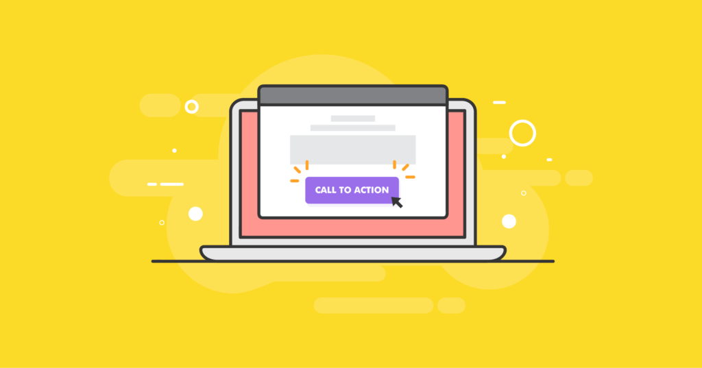
[pullquuote]In a nutshell, a call to action, also known as a CTA, is a phrase on your website that encourages users to take some kind of action.[/pullquote] A call to action is usually presented as a command, verb phrase, or action. CTAs are usually displayed in the form of a button or hyperlink that then takes the user to a location where they can complete the action.
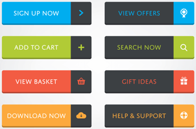
For example, common call to action, or CTA phrases include:
- Sign up
- Buy now
- Learn more
Online marketers use CTA buttons on website pages to direct people to take specific actions. Call to action buttons are typically placed in small, palm-sized areas of a webpage or on promotional materials and aim to convert someone.
Why You Need to Use a Call to Action for your Website
You definitely have come across a bright button or witty one-liner on websites that beckons to you from every angle, whether via blogs, emails, landing pages, social media posts, commercials, videos, or ebooks. But why do you need to use a call to action or CTA on your website?
Simply put: a call to action is essential to your site or ad campaign because it determines whether your lead becomes a customer. Skipping the CTA button is going to hurt your business.
The are three reasons why you need CTAs:
1. Your sales funnel needs a CTA.
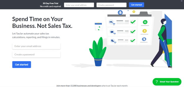
CTAs are used in a sales funnel to trigger actions for the user. They tell the user what to do next, prompting for action. They can direct users to visit your blog, give you their contact information, download an e-book, or sign up for email lists. For example, this page uses “Get More Tips” instead of “Subscribe!”
2. Customers want CTAs.
Customers want to know what steps they need to take next. The CTA is the call at the end of the page, which presents them with a button telling them what next step they should undertake. For example, if you advertise a shirt on sale, offer a “Shop Now” button, allowing customers to purchase immediately.
3. Digital advertising benefits from CTAs.
Without a call to action, you won’t be able to make your final push to entice customers. CTAs are especially important in PPC campaigns based on short phrases and links to content.
How To Write the Perfect Call To Action
As you start brainstorming the copy for your call-to-action buttons, you’ll quickly realize they are harder to write than you might think. Since there’s only a limited amount of space available on buttons, you’ll need to make sure to make each word count. Here are some thoughts on how to get started writing the perfect CTA.
1. Use verbs and strong action words.
Calls to action are a unique type of website copy because they are very action-oriented. For this reason, you’ll want to use verbs and strong action words. You’ll notice most successful CTAs begin with verbs, like:
- Buy now
- Start Now
- Download Now
- Sign up
- Create Account
- View demo
- Join free
- Enter now
2. Make it personal.
To make button copy more engaging, you can use phrases like “Claim My Seat” or “Yes, I Want My Free Gift.”
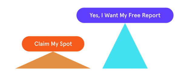
The fact that both phrases are written in the first person shows that you have already prepared something special for each visitor. All they have to do is claim it.
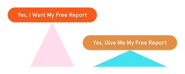
3. Offer something for free.
Once you add the word “free,” conversion rates generally go up. Here is an example that includes this magic word.
4. Know your audience.
Everyone needs a unique explanation because everyone has different interests and points of view. As a result, your CTA button should reflect that understanding. The more familiar you are with your audience and their demands, the higher your conversion rate.
5. Put the focus on your audience.
It’s important to use “you” when dealing with more specific calls-to-action and web pages. For example, “Start your free trial.” You can create something relatable and convincing when speaking to your visitors. If you convince someone that what you’re selling is already theirs, that’s a major step ahead of them.
6. Invoke urgency.
The intense feeling of pressure and urgency can be an advantageous factor in a number of scenarios. If you want to make your product seem better for a potential customer, you should create a sense of urgency by adding terms like “only” or “few.”
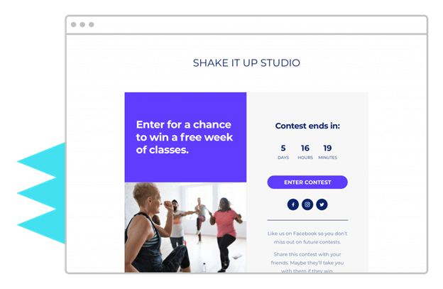
Provide urgency when crafting a CTA for an offer with limited time in the spotlight. This can be done by highlighting that time is fluid. Use words like “now” or “today” in your marketing strategies to create urgency—all the countdown clocks on your landing page help to highlight that the sale has a limited time.
Call to Action: 3 Tips and Best Practices
CTAs, or call-to-action buttons, are widespread. We rarely click any of the hundreds we see. So how can you increase the number of times your call-to-action buttons are clicked? Knowing the appropriate strategies is crucial to success.
Proper placement of the call to action button, how the button looks, and appealing content for the button is extremely important to grab the reader’s attention. If you don’t know where to start, try the Advanced Button Block by Kadence WP. This block will help get you started with aesthetics and content for your call to action.
Also, be sure to check out the Info Block. This block is a flexible way to display text and media content on your pages and posts within the block editor. You can configure it in many different ways, from creating a simple menu with icons and text to an entire staff grid.
Here are some essential elements you must not overlook when creating a solid call-to-action strategy for your clients.
1. Consider the CTA’s placement on the page.
The likelihood that a client will stop by and respond to your call to action scheme depends on two critical factors: how and where you place it. In the client’s eyes, the call must stand out compared to everything else. It should not be surrounded by a lot of text and be positioned where it is most likely to be noticed, such as in the center of the page.
2. Put effort into the design and aesthetics of your CTA.
Your CTA’s first impression on viewers will significantly impact how they respond to it. In the case of a call to action marketing, the initial impression drives the choice. You must pay close attention to your CTA strategy’s tone, look, and format (button, inline, pop-up, form).
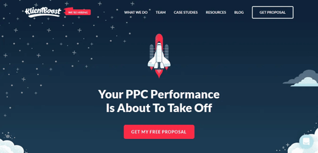
Consider Klientboost’s landing page as an example. The website features 2 CTA buttons (each serving the same purpose but placed and colored differently).
What you must do is as follows: Find the two CTA buttons and evaluate how much of your attention each one can capture:
3. Make your CTA crisp and to-the-point.
One of the most challenging problems is coming up with appealing content for your call-to-action strategy.
What will grab consumers’ attention and persuade them strongly enough to convert them into potential buyers for your market, and why should they behave the way you want them to?
Before creating the content, ask yourself these questions. Then, through your call to action strategy, strive to deliver clear and concise responses to them.
Take a look at the Netflix website. The phrase “Watch Anywhere” is a concise and bold addition to the CTA Button. “Cancel Anytime” is a deal that is so enticing that clicking the CTA Button is impossible to resist.

By setting a proper call to action and presenting your plan to clients on an attractive website, you can inspire confidence in them. The backdrop of your website is important because it gives added detail and persuasion to your plan.
Take a look a these two CTA examples:
Our Favorite CTA Examples
Here are a few examples of well-crafted call to action or CTAs.
1. Buffer
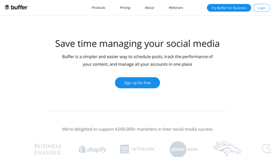
Buffer‘s homepage is highly minimalist, with no item visible. It all comes down to the CTA and a catchy title. They get bonus points for using consistent styling for their global navigation buttons and the central CTA on their homepage.
2. Campaign Monitor
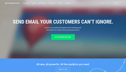
Campaign Monitor took a risk by positioning its signup button above a video on its webpage. Fortunately, their video has a dark overlay. It is blurred out in sections to guarantee that the text and button stand up on top of it throughout.
3. Chargebee
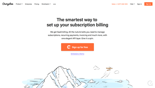
Throughout their website, Chargebee uses the color orange to denote action buttons. The essential CTA on their webpage is more prominent than the body content and has a perfectly sized logo and enticing wording. You simply click it – excellent work, Chargebee!
4. CharlieHR
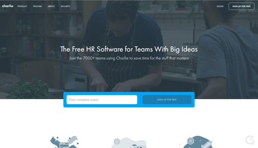
CharlieHR extensively promotes the concept of “free” in their CTAs, both on the homepage and across the site. Their signup box on the homepage is completely noticeable. It serves as a technique to entice you to scroll down the page to learn more.
5. ChartMogul
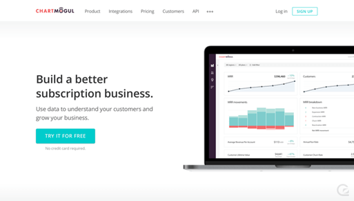
ChartMogul uses the space under their essential CTA to address a common fear among potential SaaS users: “Will I need to provide my billing information before I can try this out?”
A/B Testing For Your Call To Cction
You can improve the user experience of your blog posts by tweaking buttons. However, if you want to know how to differentiate tailored audiences best, you must engage in A/B testing. To improve your CTAS, you should test them by changing the color of one to see what the best option is. This process is called A/B testing.
The A/B test allows us to compare the reaction of two or more versions of a message to a sample of our target audience. With this method, you will be able to determine which elements will be most effective in capturing the attention of your target audience.
Our next step will be to learn how to perform an A/B test on the CTA.
CTAs provide a wealth of variables that can be used to test our users’ reactions. Let’s focus on the most important things to A/B test.
1. Color
A person is subconsciously influenced by color. You can exploit this in a positive way, adding warm colors to create positivity and cold colors that produce serenity and confidence. Green creates relaxation while blue elicits trust.
To find which color scheme best suits your objectives, getting creative and experimenting with various colors is vital. Highlighting the call-to-action with contrasting colors will make it easier for users to identify them, but be cautious not to go overboard and use colors that clash, which can ruin the image.
2. Size
The size of the button could influence potential call-to-action strategies. More oversized buttons may be too overbearing on readers and increase the user experience, while smaller buttons make it difficult for readability and higher conversion rates.
Having well-balanced and convenient button sizes on your mobile site is essential. This will help reduce bounce rates, keeping your visitors more engaged.
3. Position
Placing the CTA button before a content description converts better in some cases. Placement doesn’t need to be changed for every email type. You can also place CTAs in different places. Alternatively, you could use left, right, or center alignment.
4. Wording
The reader should know what will happen when they click on the link. Keep your message clear and use exciting ideas to keep people interested.
The traditional Buy now is one illustration. You may need to alter the style of your CTA button, such as adding a less aggressive phrase or changing its appearance. The words “buy now” might produce more clicks but could confuse new visitors. We advise you to use milder options in this situation, such as “Continue shopping.”
Voice is another way to experiment. For instance, testing the outcomes of an imperative, such as “Click here” as opposed to the first person singular, “I’m clicking,” may prove interesting.
Additionally, you can change the text’s length and gauge its effectiveness. You can test by trying to add or remove words while keeping in mind optimal practices that employ a maximum of 3-5 words; even changing one word can make a difference!
Special effects
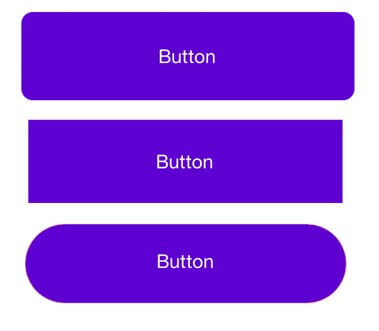
One way to change the look of a button is to use a shape that is not traditionally used. You could also add special effects, such as a pulsating button or changing color. These elements could be adding a shadow or introducing a 3D effect.
Wrapping Up: The Power of Call to Action and CTAs
These definitions, rules, and examples can significantly assist you in drawing the best out of your organization and implementing Call To Action in the most effective manner. But you must keep exploring since there is no universal key or single path to achievement.
A strong call-to-action can be many things, but remember that your goal is to persuade people to take action. A compelling CTA is designed solely to convince the visitor to take action.
While it must not be elaborate or clever, it should convey value and use unusual language. Consider your brand culture and voice. Your call to action should include both. To see our guide in setting your website content with the best recommendations, check out our website content checklist.

Download Kadence Theme & Kadence Blocks To Build An Effective Websites
If you love to create compelling content with beautiful design, Kadence Blocks provides tools to be creative right in the native WordPress editor. Plus, enjoy tons of prebuilt content you can easily include in your site, including a wireframe library of blocks to get your started on your next web design. Great for inspiration and fast development!
Join us for the next Solid Academy Webinar!
Free weekly webinars that will help you master WordPress and increase your business's bottom line.
What is a WordPress Phishing Attack?
Learn how to identify and prevent phishing attacks on WordPress websites.
Kiki SheldonWebsite Protection: 5 Ways to Keep Your Website Safe
Robust website protection is the shield that stands between your business and relentless cyber attacks. Prioritizing website protection enables businesses to fortify defenses to safeguard their online presence and preserve the trust of their customers in the face of ever-evolving cybersecurity threats.
Kiki Sheldon23 Ideas To Grow Your WordPress Business in 2023
WordPress is the most popular website-building platform worldwide, trusted by numerous brands. WordPress enables you to build a user-friendly and highly reliable site, together with tools and plugins to enhance your marketing and work like a lead magnet. All these features make WordPress the platform chosen by more than 43% of businesses globally.
SolidWP Editorial TeamSign up now — Get SolidWP updates and valuable content straight to your inbox
Sign up
Get started with confidence — risk free, guaranteed


