Creating the Perfect Ecommerce Store Page: Best Practices for Web Designers
Online shoppers today are spoiled for choice. That's why it's vital to make your ecommerce store stand out from the crowd. In this article, we'll take a look at what makes the perfect ecommerce store page and how you can replicate these keys to success in your own ecommerce store page design. We'll even share some examples of our favorite online stores so you can learn from the pros.

Online shoppers today are spoiled for choice. That’s why it’s vital to make your ecommerce store stand out from the crowd.
In this article, we’ll take a look at what makes the perfect ecommerce store page and how you can replicate these keys to success in your own ecommerce store page design. We’ll even share some examples of our favorite online stores so you can learn from the pros.
Let’s get started!
What Is an Ecommerce Store Page?
An ecommerce store page is a website where a business can sell its products or services to online shoppers. Some businesses have an ecommerce page in addition to a brick-and-mortar store, while many businesses today exist only online.
Statistics show that approximately 24 million ecommerce websites exist today, which is rising quickly. It’s expected that by 2025, ecommerce will make up 24.5% of the world’s retail sales.
Whether you’re selling physical goods, services, or digital products online, there’s one more vital thing you should know about your ecommerce store page. It’s your chance to impress online shoppers by showing them what you’ve got and why they need it.
Do that well, and you’ll be converting customers like crazy. Do it poorly, and your ecommerce page’s visitors will be put off and choose to go with your competitor.
Why Is an Ecommerce Store Page Important?
So why would a business choose to create an ecommerce store page rather than sticking with a brick-and-mortar storefront? There are a few very powerful reasons why more and more businesses are opening online stores.
Firstly, an ecommerce store page can potentially increase your customer reach radically. With the power of SEO (Search Engine Optimization), new audiences will see your products who would never have known about them otherwise.
Secondly, your ecommerce store page works around the clock to bring in sales for your business. It doesn’t have business hours, so you won’t miss out on those customers who prefer to shop at 3 in the morning. (And they can enjoy the convenience of shopping in their pajamas!)
Your ecommerce store is a highly effective way to grow brand awareness about your business. By having an online presence, people will be able to find your products easily. And by having an excellent ecommerce store page, you’ll appear far more trustworthy and legit to shoppers doing their research.
How to Create the Perfect Ecommerce Store Page
Designing an ecommerce store page in WordPress can seem intimidating – but never fear! Kadence Blocks makes it so easy to design your online store without requiring coding.
While you want your ecommerce store page to be unique, there are certain must-have qualities that an ecommerce website needs to have to be successful. Let’s take a look at how to design an incredible ecommerce page.
Make Navigation Easy
Studies have shown that you only have a few seconds to captivate your shopper – so make sure you get them to the right place in your online store quickly and easily. This all comes down to how your navigation is set up.
So how do you make sure your navigation menu is user-friendly?
- Use clear and simple language when naming your categories. Using creative names for your categories might be tempting, but this will only confuse your website’s visitors.
- Put your navigation menu in a highly visible and common sense spot on your homepage. That normally means putting your primary menu in your page’s header and your main page links (i.e., “Home,” “About,” and “Contact“) at the top left of the page.
- Use breadcrumbs. Breadcrumbs allow visitors to find their way back to previous pages or categories easily. They’re also great for SEO because they outline the structure of your website.
Simplify EVERYTHING
When it comes to designing the perfect ecommerce store page, your goal should be to keep things minimal. You want to keep leading your visitor toward buying something, and this means taking away unnecessary distractions.
Visually, avoid using too many colors on the page, having an off-putting amount of text, or having too many images within a small amount of space. Banner ads and pop-ups are things to be used sparingly.
Simplify the customer journey. That means guiding the customer through as few steps as possible toward making a purchase. If they feel like they have to jump through too many hoops, shoppers will simply give up and leave your site.
Focus on Branding
To put it simply, consumers buy from brands they trust. No one wants to hand over their personal details and credit card information to a brand that seems sketchy or faceless. One of the most powerful ways to gain an online shopper’s trust is through your branding.
Branding is about more than just having a cool logo. It’s about who you are as a company. Get clear on what your brand’s values are, what you stand for, and what makes you stand out from the competition.
Effective branding helps customers relate to your company. It builds an emotional connection with your audience, where they feel like they’re dealing with people, not robots.
Branding helps your company become familiar to customers. By using consistent messaging and voice in your content, consistent visual elements, and even consistent color schemes, you’ll make it easier for your audience to recognize you. Brand familiarity builds trust.
Make Content Engaging and Scannable
When it comes to content on your ecommerce page, it’s about quality rather than quantity. Don’t be afraid of leaving white space on the page – in fact, prioritize it. If your shoppers see huge chunks of text, they won’t want to commit to reading it.
Lay out your text in a scannable way. That means breaking it down into digestible pieces of information. Some ways you can do this are:
- Using simple, to-the-point language
- Separating text into small paragraphs
- Utilizing bullet points
Make sure your content is relevant and relatable to your audience. Use words they would use in everyday life. Be authentic and human in the content you include – people will be able to sense that you’re being genuine, which will build their trust.
Choose High-Quality Images
Online shoppers don’t have a way of experiencing the product for themselves – they can’t pick up the product and look at all angles of it. Your job is to give the customer an experience of what they’ll get through the effective use of product photos.
Make sure you are using well-lit, professional-looking photos that have a high pixel ratio. Use multiple photos from different angles and a photo of someone using the product. Make the images zoomable and even rotatable if possible.
Show Social Proof
It’s easy to underestimate the importance of including reviews on your ecommerce store page. Who even reads these things? Well, it turns out 93% of buyers read online reviews before making the decision to purchase a product or not. 81% of online shoppers say that an ecommerce store without reviews seems untrustworthy. Social proof is an effective tool in your marketing efforts.
It’s a fact: humans are inclined to do something if everyone else is doing it. Reviews on your ecommerce page are a way of showing that your products are amazing in a much more believable way than if it were your company talking about itself.
Perfect Your User Experience
User experience (or UX) is how your customer interacts with and experiences your product. What’s the experience like for someone visiting your ecommerce page? How can you improve that experience for them? Here are just a few ideas:
- Personalized product suggestions. Personalization is critical in providing a positive user experience. Offering suggestions based on what a shopper already has in their cart allows them to find more products they’ll love.
- Optimize your website for speed. If your ecommerce page is moving slowly, shoppers won’t stick around to wait for it to load. It’s essential to put focus on the speed of your website.
- Offer fabulous customer support. This could be as elaborate as a call center or as simple as a chatbot that answers frequently asked questions. Online shoppers expect to be able to get fast, efficient help when they need it.
- Award loyal customers. Loyalty programs are a way to make your existing customers feel like they’re essential, plus they’re a great way to get new customers for your ecommerce store.
Speed Up the Checkout Process
According to a recent study, 40% of consumers say that the reason they shop online is to save time. Because of this, the last thing you want to do is waste your precious time with a slow check-out process.
Kadence Shop Kit allows you to customize your checkout flow easily. Reduce checkout friction by customizing the checkout to your customers’ unique needs. Enable and disable checkout fields or create your own fields using the checkout manager. Easily customize your checkout forms and control which fields are added to WooCommerce emails.
Allow guest checkout for your customers rather than requiring that they create a profile. You might miss out on gathering some useful information on them, but it’s better than losing the sale altogether from an abandoned cart.
Optimize for Mobile
Online shoppers don’t just visit your ecommerce page on their desktop – many of them will be viewing your store on their phones. Mobile web browsing is taking over more than ever before, so consumers expect your website to function beautifully on their phones.
It’s important to choose a fully responsive WordPress theme. Otherwise, you will lose a lot of customers from your store looking unprofessional and untrustworthy. We highly recommend Kadence – a theme that stays attractive whether on desktop or mobile.
Prioritize Security
One of the absolutely vital elements of any successful ecommerce store page is that it’s secure. Your customers need to know they can trust your brand with their personal information. Showing an SSL certificate and choosing a highly effective security plugin like iThemes Security Pro for your WordPress site is essential.
Without proper security, you put your business and your customers at risk of experiencing fraud or identity theft. And you better believe those customers will stop buying your products and spread the news about your brand.
Examples of the Best Ecommerce Store Pages
Want to see these best practices in action? Here are 5 of our favorite ecommerce store pages, with a breakdown of what you can learn from them.
1. Laird Superfood
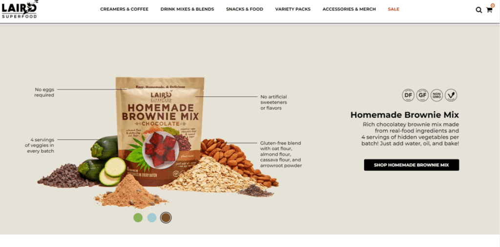
Laird Superfood’s ecommerce page is simple yet impactful, with very creative use of images. We love how they used the product images to discuss their products’ benefits rather than using plain old bullet points.
The navigation menu is bold, with clear labeling for categories. A “Featured Collections” bar shows ultra-close-up images of the yummy food in each category. Scroll down on their page, and you’ll see a quote from the founder about how he believes in what he sells. That genuine human touch builds trust.
2. Mac Cosmetics
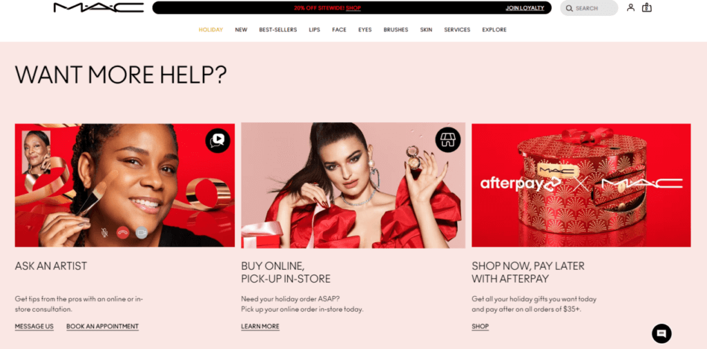
The ecommerce store page for Mac Cosmetics assumes that its visitors already know about the brand and cuts straight to the chase by offering a discount as its main headline. This online store is set up for a positive user experience from top to bottom.
Instead of having a footer menu link for “contact us,” Mac dedicated a whole section to customer satisfaction with the headline “Want more help?” They provide value and convenience by offering exciting makeup consultations, an option for faster pickup, and a “buy now, pay later” payment option.
3. Jus Jus

Jus Jus puts its product in center stage on its ecommerce store page, with a full-screen photo of the bottle as the only focus of your attention. Scroll down, and you’ll notice something very interesting: there are no “buy now” buttons or prices.
Instead of going straight for the sale, this company weaves a story, starting with their “about page” – something that’s often a side-note on other ecommerce websites. To actually order a bottle of wine, you have to click on “shop” in the top navigation bar. That’s a bold move that could result in a loss of sales but instead makes the visitor feel delightfully unrushed.
4. Wagmo
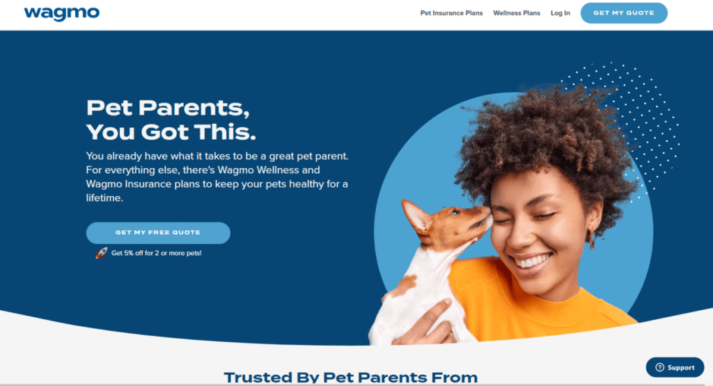
The first few things we love about Wagmo’s website design? Firstly, a simple but bold color scheme stays consistent with the company’s logo color. Next, a playful photo of a woman with her dog would make anyone smile.
Then there’s the wording they choose to speak to their audience – it’s relatable and conversational. Instead of coming across as a cold, heartless insurance company, Wagmo has successfully done the opposite.
5. Sugarpill
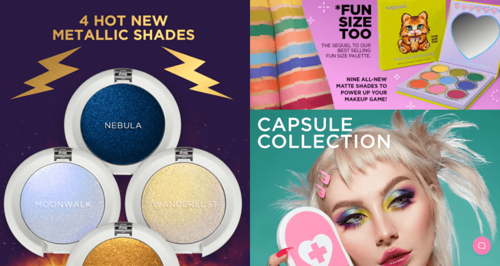
Sugarpill meets its audience on common ground with the design of its ecommerce page. Their product appeals to people who love vivid, colorful makeup – so they’ve reflected those visual elements in their website.
Their main navigation menu expands to show subcategories, ensuring that shoppers will find exactly what they’re looking for. In the categories pages, the thumbnails of each product change to a different angle when you hover over them.
Wrapping Up
Your ecommerce store page should be unique and showcase your personality – while still sticking to the best practices that drive an online store’s conversion. Kadence Shop Kit is a powerful WooCommerce extension that gives you everything you need to create the perfect ecommerce store page. Get ready to stand out from your competitors and watch your sales skyrocket!

Grow Your eCommerce Revenue with
Kadence Shop Kit
With over 15 powerful modules, Kadence Shop Kit is the most robust WooCommerce extension available.
The Kadence Shop Kit allows you to create dynamic and attractive product layouts, display product images that convert customers, create ways to display product variations, and design dynamic galleries that connect with customers.
Kadence Shop Kit also helps you create immediate social proof with great reviews, build dynamic information tabs, leverage brand influence, optimize your checkout flow, and so much more!
Join us for the next Solid Academy Webinar!
Free weekly webinars that will help you master WordPress and increase your business's bottom line.
What is a WordPress Phishing Attack?
Learn how to identify and prevent phishing attacks on WordPress websites.
Kiki SheldonWebsite Protection: 5 Ways to Keep Your Website Safe
Robust website protection is the shield that stands between your business and relentless cyber attacks. Prioritizing website protection enables businesses to fortify defenses to safeguard their online presence and preserve the trust of their customers in the face of ever-evolving cybersecurity threats.
Kiki Sheldon23 Ideas To Grow Your WordPress Business in 2023
WordPress is the most popular website-building platform worldwide, trusted by numerous brands. WordPress enables you to build a user-friendly and highly reliable site, together with tools and plugins to enhance your marketing and work like a lead magnet. All these features make WordPress the platform chosen by more than 43% of businesses globally.
SolidWP Editorial TeamSign up now — Get SolidWP updates and valuable content straight to your inbox
Sign up
Get started with confidence — risk free, guaranteed
