Homepage Examples: 8 Inspiring Ideas for Your Next Web Design Project
Looking for homepage examples you can use as inspiration for your next web design project? Homepage design matters. And we’re with you, because we know that the right homepage design can give your business a competitive edge. Your homepage is super important to get right. After all, it’s your customer’s first impression of you, and most consumers tend to form an opinion of you and your company within the first three seconds of landing on your homepage.

Looking for homepage examples you can use as inspiration for your next web design project? Homepage design matters. And we’re with you, because we know that the right homepage design can give your business a competitive edge.
Your homepage is super important to get right. After all, it’s your customer’s first impression of you, and most consumers tend to form an opinion of you and your company within the first three seconds of landing on your homepage.
Your homepage also has the responsibility for drawing your website’s traffic. Rather than treating it like a landing page built around one action, a homepage should be designed to support all traffic from a variety of audiences and origins.
That means your homepage needs to attract traffic, educate visitors, and invite conversions. No pressure, right?
Though it’s so important to get right, many businesses struggle to design their homepage properly.
A well-designed homepage needs more than looks alone – it also has to have purposeful content that provides a starting point for your visitor’s journey through your site. That’s why the homepages on this list are not only noted for their design, but for their creativity and conversion potential.
Below are some of the best homepage designs we’ve seen around the web, categorized by the design or optimization technique that makes them so aspirational.
1. A Clear Identity
If you’re a well-known brand or company, you may be able to get away with not having to describe who you are and what you do. But, unless you’re Coca-Cola or Apple, for example, your business will still need to make clear who you are so that each visitor knows that they are in the right place.
Even though you have the obligation of stating who you are, you can still get it done in a clever and catching way. For that, look to our first example below, KIND snacks:
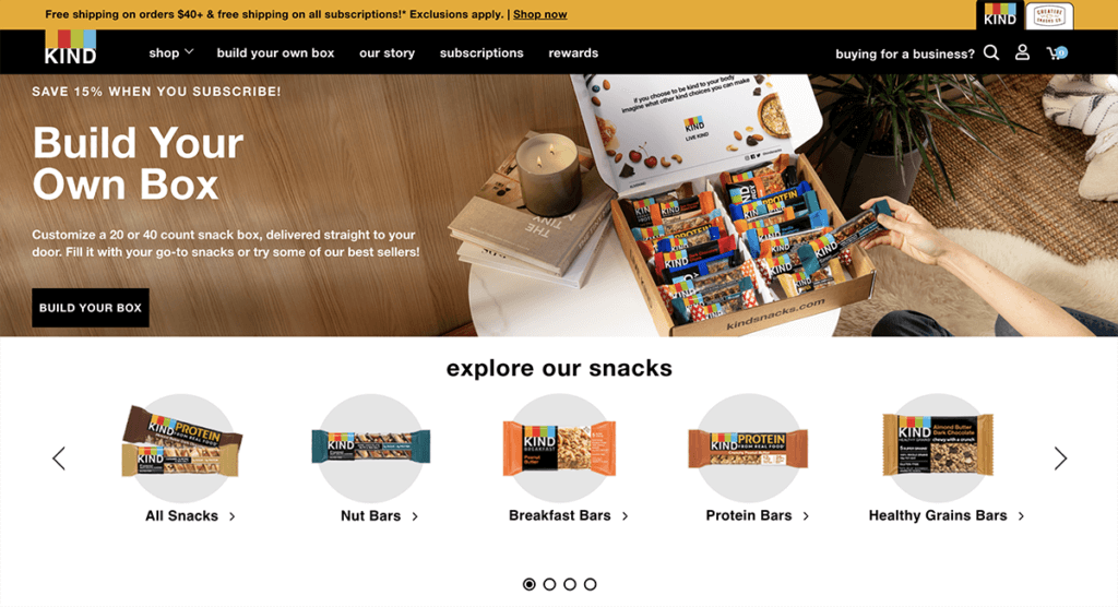
Why We Like It:
- We know what the company is right away: the combination of a feature product image and smaller product thumbnails lets us know KIND is more than a bar.
- KIND Snacks’ tagline is straight up brilliant. With easy and clear language, the message immediately resonates and makes us want to read the snack bar’s label for ourselves.
- The bold colors produce contrast, making the words and images stand out on the page. Plus, the coloring is consistent with the packaging you’d see on KIND products in stores.
- We don’t need to know when KIND Snacks was founded and their mission right away: those are saved for navigation links.
2. Easy Navigation
This brings us to our next inspired design tip: users will have to know how to get around your page. A well-designed navigation shows legitimacy, credibility, and authority. All customers expect easy navigation, or else they’d be clicking off your page fast. Give a clear path to the pages they need right from the homepage. Make the navigation menu visible at the top of the page, and organize the links in a hierarchical structure. Bonus points for writing clever but clear copy for each of your navigation links. For this example, take the mouth-watering Slim & Husky’s Pizza.
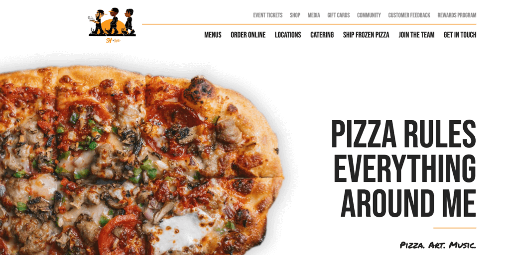
Why We Like It:
- The top-right menu navigation couldn’t be easier to find. Simple and direct calls to action are in each clickable navigation link.
- The font and coloring are consistent with the branding. The large tagline draws your eye to the right, with the navigation links, in the same styling, are right above.
- The simple but smart layering of the two navigation options help users easily get around. The more common clicks, like menu, ordering, and locations, are first up. The less common but still important shop, media, and events are smaller and lighter. We would definitely consider ordering pizza from them!
3. A Captivating Mood
Every color, font, image, and line affect visitors differently in terms of mood, tone, and atmosphere, so every decision is important. The good news is that your company or brand has likely already brainstormed its mood and tone when coming up with its mission and purpose. So, when designing your homepage, simply choose the elements that align with your mood. However you want your users and consumers to feel about your product should be conveyed right in those first three seconds.
For this example, we turn to Airbnb, who knows how to sell mood.
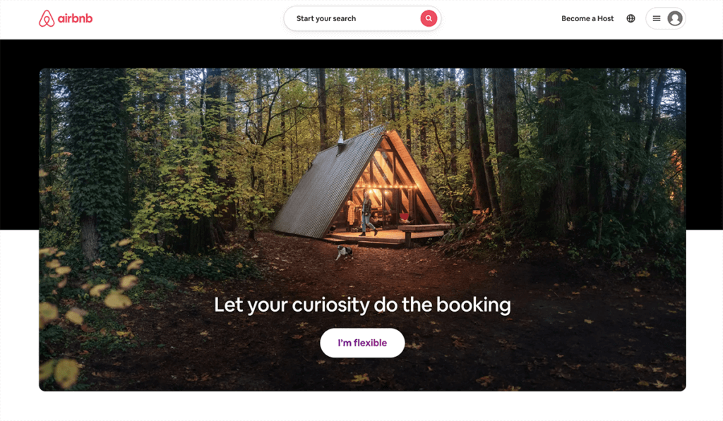
Why We Like It:
- Airbnb knows they sell unique stays, so naturally, your wanderlust immediately activates when clicking on their homepage.
- Using a full-page image is powerful – users right away want to see themselves on the adventure that Airbnb is selling (more on the power of full page images below).
- It includes the search form that most visitors come looking for right up front to immediately turn that mood into a meaningful click.
4. Full Page Images
Since 65% of people are visual learners, using a full page image is one way to captivate your audience. However, don’t just go pasting in any old image just because it seems trendy. Make sure to use an image that clearly indicates or supports what you offer and what your business is about. Use images that capture emotion, drive action, and visually tell the story you’re trying to tell. When using images, high-quality images with reduced file size (tools like TinyPNG can help) and be use to add alternative text to images to make them accessible to those who use screen readers.
For an example of a highly-effective image, look for further than 4 Rivers Smokehouse.
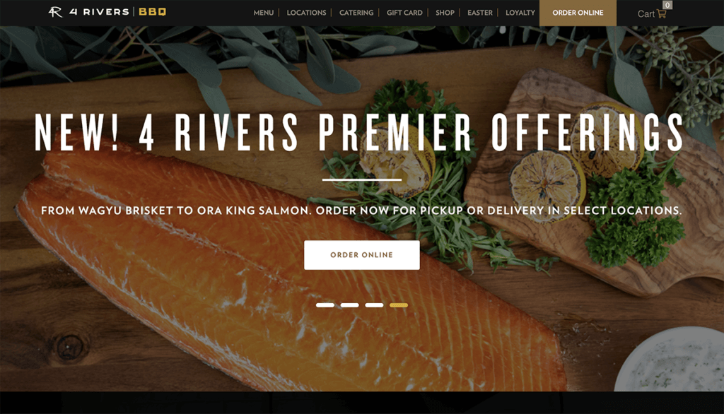
Why We Like It:
- The image immediately makes our want the product. No writing in the world can sell like a mouth-watering image.
- If folks clicking this link aren’t sure what 4Rivers is reading the name alone, this image sure answers that question.
- This image is also sure to appeal to 4River’s customer-base. The image paired with the headline create a sense of high-demand, meaning this product must have been worth it to have a comeback.
- The image is the right amount of contrast and focus for the tagline and “order online” button placement, with enough space at top for a clear navigation bar. Remember to choose an image that is both captivating but stll allows enough negative space for text navigation.
5. Well-Placed Calls to Action
All websites want visitors to take action after visiting their site. A Call to Action (CTA) is not always an immediate sales push, but it could lead customers down the sales funnel. When designing a homepage, the CTAs must be logically placed with other necessary buttons. It could be “Order Now” or “Free Trial” or “Learn More.” A simple but effective CTA tells them what to do next so they don’t get overwhelmed or lost. A CTA should also be visually striking, ideally in a contrasting color to the rest of your homepage so that it pops.
Just look at FreshBook’s green CTA button below.
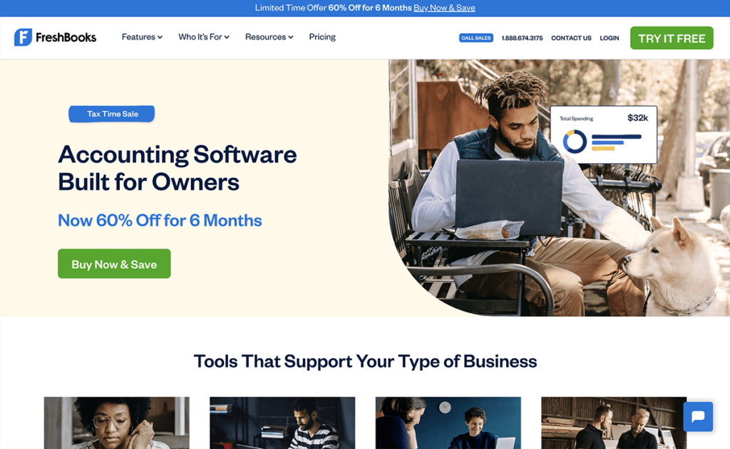
Why We Like It:
- There’s great use of contrast and positioning with the CTA. Though the primary color pattele is light blue, the green accent makes for a great button color. Adding in that users can get started “for free” is sure to earn more clicks, too.
- The statistic right next to the CTA – that 97% of small business owners recommend Freshbooks – is exactly the encouragement a wavering customer needs to see in that moment.
- Though there’s an informational headline ans a small product blurb, the page is mostly focused on getting users to click that button. Plus, your eyes can’t help look down and see the large companies and publications that have mentioned Freshbooks, lending more credibility right around that CTA.
6. Put Benefits Up Front
It’s not only important to describe what you do, but why folks on your site should also care about what you do. Prospects want to know about the benefits of buying from you because that’s what will compel them to stick around. Keep the copy lightweight and easy to read, and speak the language of your customers. For a company sells benefits up front, learn from Evernote.
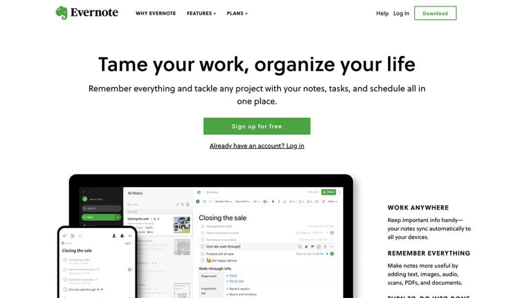
Why We Like It:
- The benefit could not be more clear: “Tame your work, organize your life.” The eye path then leads you to its call-to-action, “Sign Up For Free.”
- It does a great job of listing benefits on their homepage in a simple white font that’s not too distracting and captures the essence of the product in easy to understand copy.
- This homepage makes great use of a full page image and its signature bright green and white highlights to make conversion paths stand out.
- Evernote also offers a one-click signup process through Google to help visitors save even more time.
7. Minimalism
As we discussed before, minimalism is poised to be a top web design trend this year. Think of sleek and sophisticated effects on homepages. Less crowding, more room to breathe. A hard ask, with all that your homepage needs to accomplish. But, if users can clearly read and find information quickly, then that’s more important than flashy images or videos that won’t load. Think about replacing fluffy messages or stock images with light and simple CTA buttons and removing disturbance around them.
For a site that is always sleek and minimal, we turn to Medium.
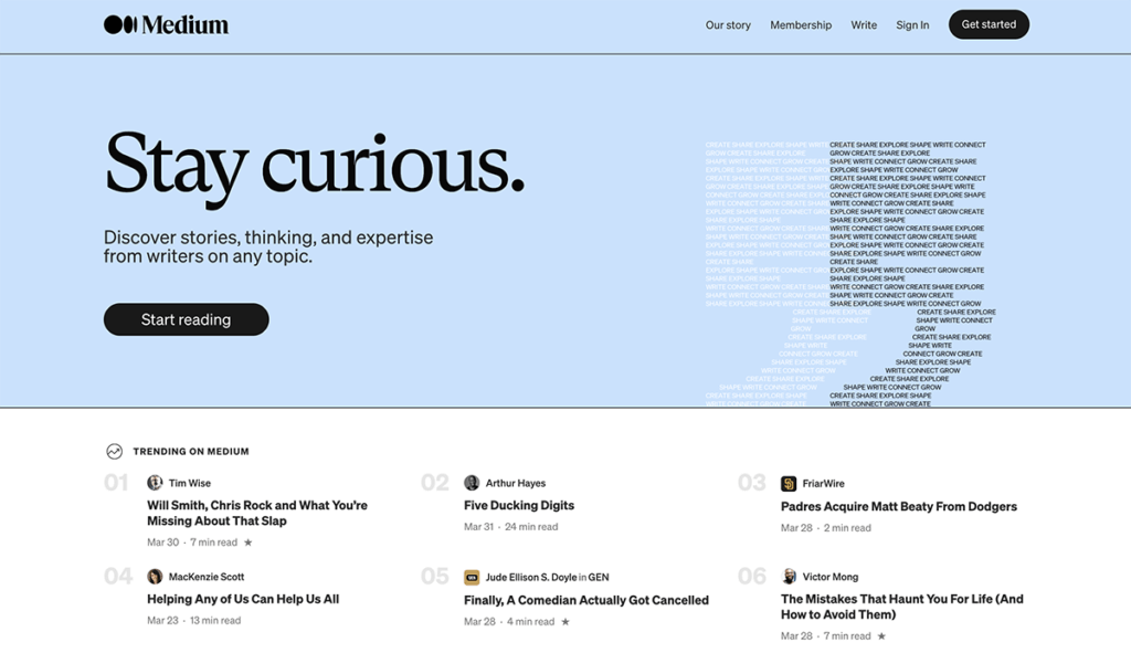
Why We Like It:
- The ample whitespace on this alternative homepage makes everything around it stand out clear. On this page, the goal is to get users to download the Medium app, so the page is designed around that feature. The rest of the site still lives in the navigation links, but here, the developers knew what their goal was at the time.
- Medium makes it easy to sign up by using a text link instead of an email. This is a great idea for a mobile site. No navigating away from this page as users look down at their phone for the text link.
- The homepage uses light-colored fonts to keep with the minimalist theme. The pops of green become even more effective.
- Nice use of social proof to get visitors to start clicking around. The “Popular on Medium” and “Staff Picks” sections let users know where to find high-quality content.
8. Embrace Video
If you spend time on the social media, you know that there are videos at every corner. Web design is also embracing the video trend with pages that play reels or short videos right on the homepage. This lets learning about your company bevomr a passive activity where users can simply sit back and see what your product is all about in a short video presentation. But – it’s got to be catchy or compelling, or users will not stick around for long.
If you think about using video on your homepage, make sure you have a solid purpose and plan. Think about load times and how videos enhance the purpose behind your site. Is your product or company something users have to see in action before going any further?
For one example, see A24 Films.
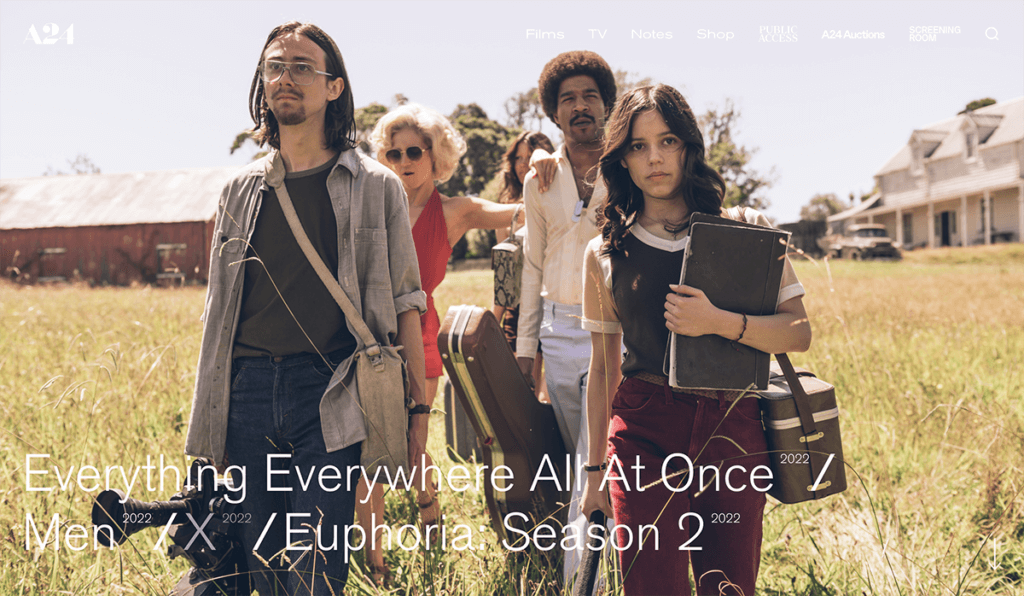
Why We Like It:
- It certainly answers the question of necessity: a film company is surely the right fit for a full-page video on its homepage.
- Seeing that the video is a trailer for an upcoming film project, it tells the user what the aesthetic and product is right away. This is simply something you have to see in motion to understand full.
- At the top of the homepage, A24 offers a simple navigation bar for ways to learn more or how to get in touch. It knows that users on this site are most likely to want to learn about the film studio and then want to contact someone for more information, so it couldn’t be easier to find. All that with a full video to boot!
Feel Inspired for Your Next Homepage
Your homepage is like a handshake. It needs to set a first impression and encourage the user to stick around to find out more. Before they make up their mind to become a customer, they’ll review your homepage to get an idea of what you sell, why that matters to them, and how they can benefit from what you have to offer.
A brilliant homepage should incorporate at least some, if not all, of the elements mentioned above above. Hopefully by looking at these examples and why they work, you’ll be inspired to try out a homepage design that best communicates who you are. Then, you can get back to creating that stunning homepage for all to see!
Get SolidWP tips direct in your inbox
Sign up
Get started with confidence — risk free, guaranteed
Join us for the next Solid Academy Webinar!
Free weekly webinars that will help you master WordPress and increase your business's bottom line.
What is a WordPress Phishing Attack?
Learn how to identify and prevent phishing attacks on WordPress websites.
Kiki SheldonWebsite Protection: 5 Ways to Keep Your Website Safe
Robust website protection is the shield that stands between your business and relentless cyber attacks. Prioritizing website protection enables businesses to fortify defenses to safeguard their online presence and preserve the trust of their customers in the face of ever-evolving cybersecurity threats.
Kiki Sheldon23 Ideas To Grow Your WordPress Business in 2023
WordPress is the most popular website-building platform worldwide, trusted by numerous brands. WordPress enables you to build a user-friendly and highly reliable site, together with tools and plugins to enhance your marketing and work like a lead magnet. All these features make WordPress the platform chosen by more than 43% of businesses globally.
SolidWP Editorial TeamSign up now — Get SolidWP updates and valuable content straight to your inbox
Sign up
Get started with confidence — risk free, guaranteed


