Top 5 Web Design Trends of May 2022
The things we are trying this month, according to website design trends, all involve calls to action. Every one of these trends helps create a path for users to do something on your website. Some just happen to be more obvious than others. Here are five great trends to consider this month: 1.

The things we are trying this month, according to website design trends, all involve calls to action. Every one of these trends helps create a path for users to do something on your website. Some just happen to be more obvious than others.
Here are five great trends to consider this month:
1. Novelty Typefaces
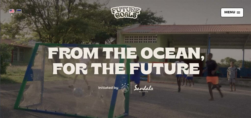
Novelty typefaces are one of those design trends that can be a lot of fun. You know these typefaces because you can’t really identify them easily by name or style and they often are things you probably haven’t seen elsewhere. Just check out this example from Future Goals.
Novelty typefaces are often used for display or short text blocks – such as the headline in the main hero area and include words to inspire action or interaction with the design.
2. Extraordinary Imagery
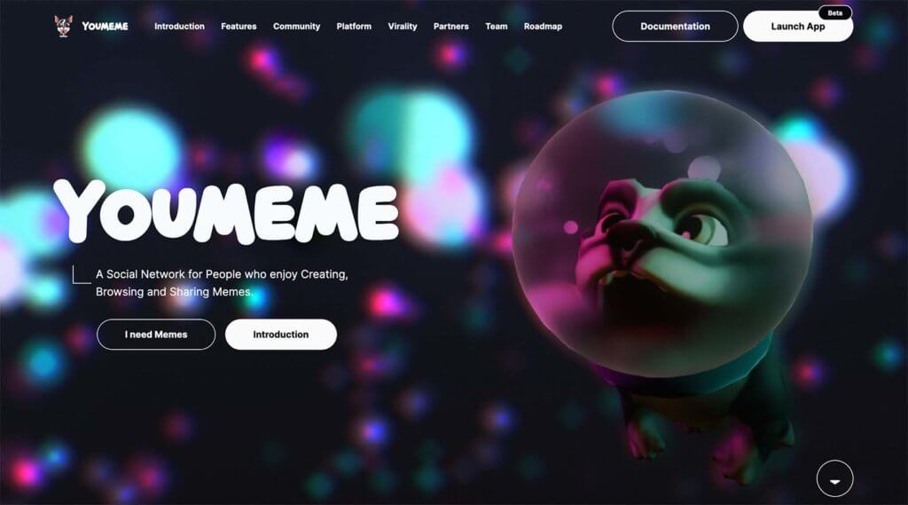
Larger-than-life images that border on extraordinary or AI-inspired are the basis for quite a few website homepages right now. This type of imagery serves a specific purpose to draw in website visitors to the content. See this in action at YouMeme.
The thing that’s cool about this website design trend is it can work for almost anything – even things you might not expect. An image element that’s oversized, colored in an unexpected way, or combined with something unusual – such as merging photos and illustrations – are all common here.
3. Popups with Purpose
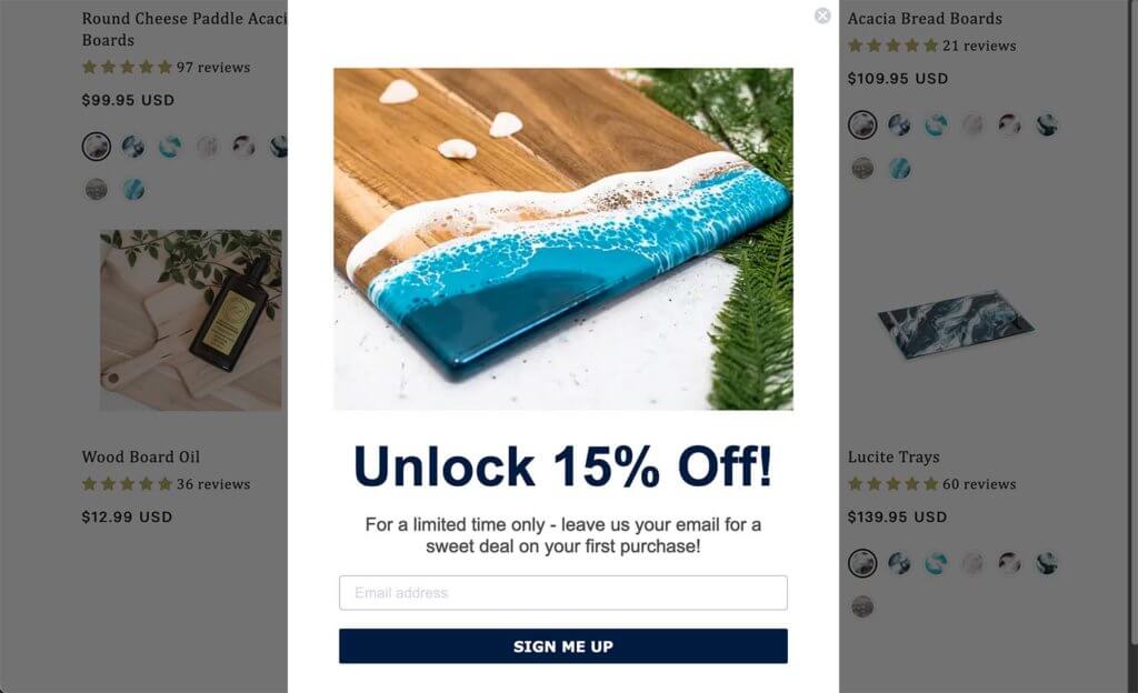
Popups can be a real hit-or-miss opportunity on your website. The reason you see so many of them is because they can work and generate sales, clicks, and email signups. Check out this example from Lynn & Liana.
For a popup to really work, it has to provide something valuable for the user when they want it. This can be an offer, opportunity, or information. Just remember, a popup should only appear if it has a distinct purpose.
4. Oversized CTA
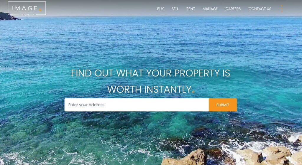
Want to get a website visitor’s attention and inspire action? Make this element a focus of the design as in this example from Image Property. While calls to action are often tucked into buttons or email submission forms such as the one in this example are tucked into the footer, this trend puts those elements out in the open.
It creates an obvious click path for users so that they don’t have to think about what to do next. The interactive cue is huge and ready to use.
5. Almost Brutalism
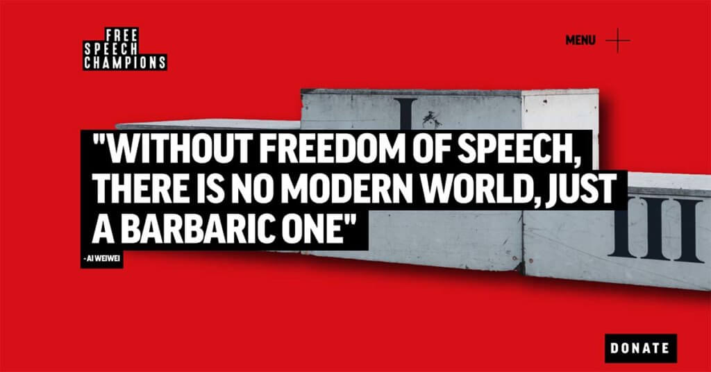
Almost brutalism is a design trend that has evolved from the brutalist designs of the past. While these websites are still somewhat harsh and bold visually, they are considerably softer than the previous iteration of brutalism. Just check out this example from Free Speech Champions.
This trend uses bold colors, big text, simple typefaces, and lots of lines. You won’t see a lot of images or light typography.
Putting it All Together
WordPress website design trends are a fun element that can keep your site looking fresh and modern. But don’t feel like you have to try every new trend that comes along. Pick the ones that are right for your website and brand to ensure that your design feels trendy but still like you.
Get SolidWP tips direct in your inbox
Sign up
Get started with confidence — risk free, guaranteed
Join us for the next Solid Academy Webinar!
Free weekly webinars that will help you master WordPress and increase your business's bottom line.
What is a WordPress Phishing Attack?
Learn how to identify and prevent phishing attacks on WordPress websites.
Kiki SheldonWebsite Protection: 5 Ways to Keep Your Website Safe
Robust website protection is the shield that stands between your business and relentless cyber attacks. Prioritizing website protection enables businesses to fortify defenses to safeguard their online presence and preserve the trust of their customers in the face of ever-evolving cybersecurity threats.
Kiki Sheldon23 Ideas To Grow Your WordPress Business in 2023
WordPress is the most popular website-building platform worldwide, trusted by numerous brands. WordPress enables you to build a user-friendly and highly reliable site, together with tools and plugins to enhance your marketing and work like a lead magnet. All these features make WordPress the platform chosen by more than 43% of businesses globally.
SolidWP Editorial TeamSign up now — Get SolidWP updates and valuable content straight to your inbox
Sign up
Get started with confidence — risk free, guaranteed

