Top Web Design Trends for February 2022
Now that we are well into 2022, it’s time to start thinking about modern refreshes and website design trends. Whether you are starting new or just looking for a few trending touches, we’ve got some great ideas to help you along the way. Here are five great trends that will keep your WordPress website looking fresh.

Now that we are well into 2022, it’s time to start thinking about modern refreshes and website design trends. Whether you are starting new or just looking for a few trending touches, we’ve got some great ideas to help you along the way.
Here are five great trends that will keep your WordPress website looking fresh.
1. Big, Big Text
The more we look at typography trends, the more we keep coming back to the concept of big text elements. And they just keep getting even bigger.
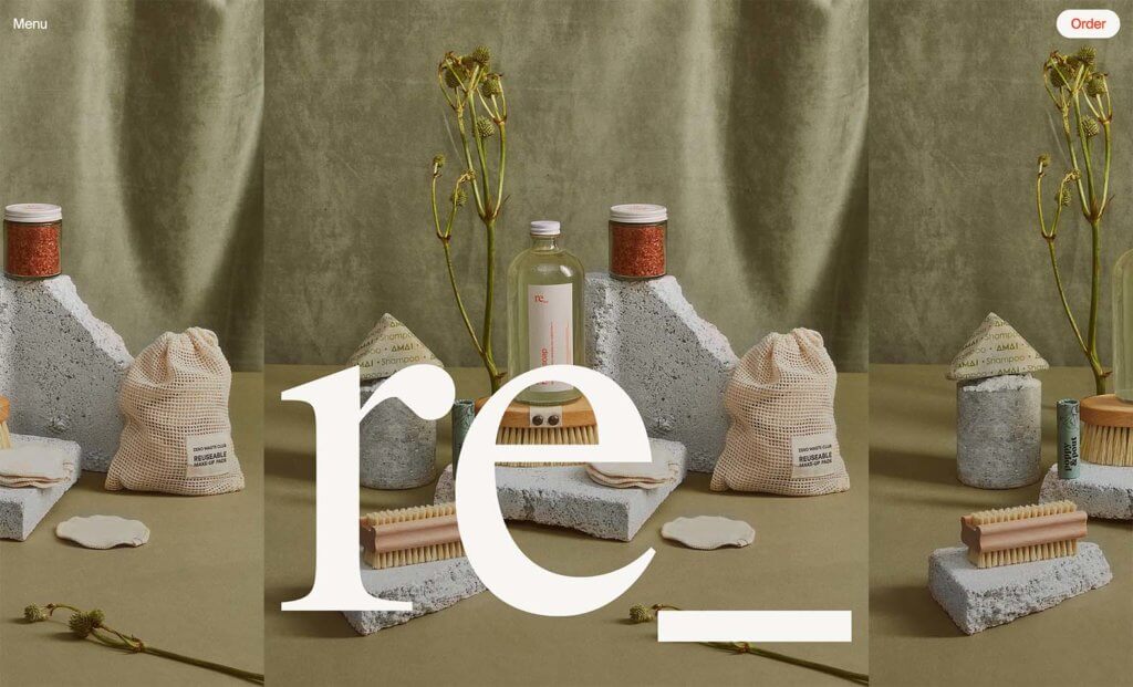
Designers are having a lot of fun with oversized text that’s fully integrated into the design, such as the text on the photo here at regrocery.co.
For the most part, this concept is used with bold images and text elements that include short words.
2. Hidden Navigation
This is one of those trends that seems to be almost everywhere, it seems completely counter-intuitive: The navigation is hidden.
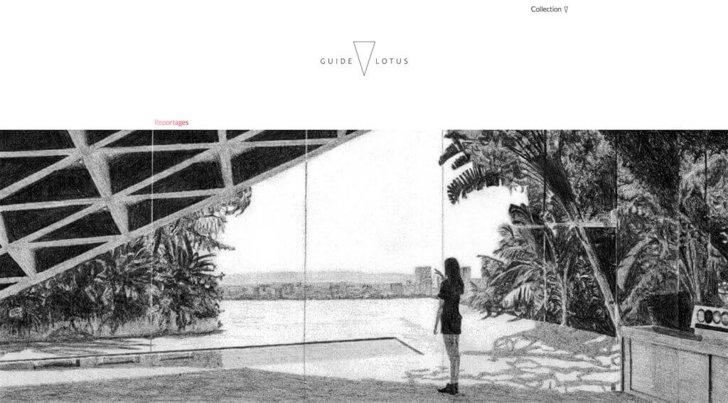
Without an obvious menu or navigation structure at guidelotus.com, designers are opting for deeper headers with more white space – reminiscent of many mobile homepages – and kicking navigation elements out of the design.
The result is a very clean and sleek visual, but is it user-friendly? This is something you’ll have to test on your website. If you go this route focus groups, user testing, and a close look at analytics to ensure usability are important.
3. Child-like Fun
Bold color, animation, and funky fonts all contribute to a more fun, child-like experience in this website design trend. With the weight of the world in the past few years, this lighter feel is a welcome option.
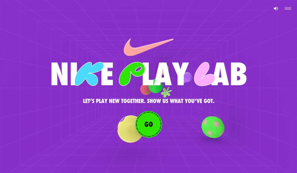
Designers are going all-in with a fully child-like theme too, just like at nikeplaylab.com. Often with a design trend like this, you see bold color or animation or funky fonts, but now we are seeing all three quite often.
There’s another element at play here as well. These “childlike” elements are also throwbacks to the 1980s and 1990s, those generations now have kids of their own. There’s an almost nostalgia that comes with this trend as it combines a childlike feel that reminds adults of their own childhoods with visual elements.
4. Mismatched Color Schemes
In design theory, the color wheel helps guide choices. We look for harmonies and combinations that will appeal to wide audiences and make a design just feel right.
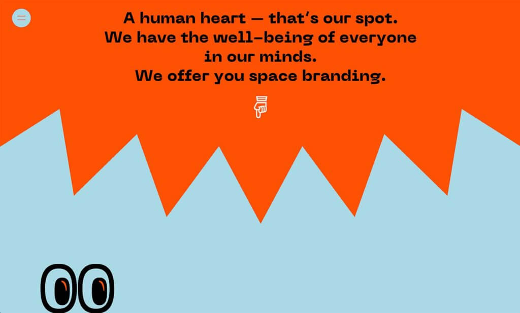
Right now, designers are throwing that concept out the door with bold color schemes that use seemingly mismatched color combinations, like at studiobardzo.com. This includes everything from colors that you would never imagine pairing to things like a bright paired with a pastel.
Admittedly, it can be a little garish. But it can also work with the right content. This color trend almost plays off of the same emotions and vibes as working with child-like design aesthetics.
5. “Magazine” Grids
When you have a blog or a lot of content that you want to showcase, a “magazine” style grid is a clean way to organize and highlight content. A magazine-style is often exemplified by a large hero image with columns of additional content blocks below. Those columns might include just one row of content to infinite scrolling rows.
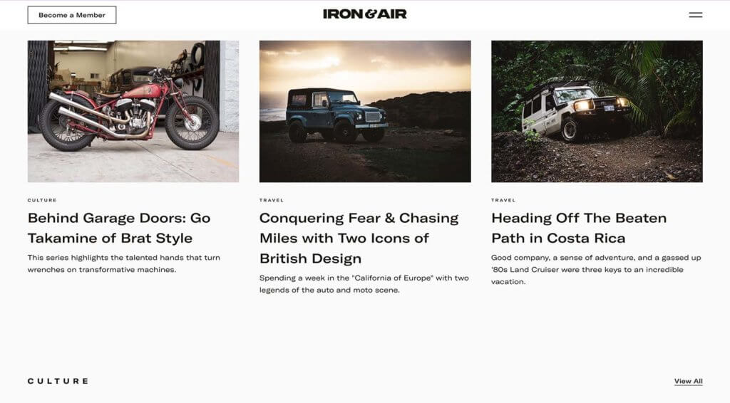
The trick to this website design trend, like at ironandair.com is all in the structure of content organization. You need a strong grid.
In the example here, you can see that every new content element has a distinct set of elements that line up perfectly. There’s no question about where to look or what to read or how the eye should flow. The structure of the grid takes all the work out of it for you, making it easy for the user to engage.
Putting it All Together
Website design trends are a fun way to keep a finger on what visual elements people are paying attention to. Remember that it can be just as important to see what stops trending as what is so that your projects don’t begin to look dated.
Need a better set of page-building tools to give you more web design power? Check out Kadence Blocks!
Join us for the next Solid Academy Webinar!
Free weekly webinars that will help you master WordPress and increase your business's bottom line.
What is a WordPress Phishing Attack?
Learn how to identify and prevent phishing attacks on WordPress websites.
Kiki SheldonWebsite Protection: 5 Ways to Keep Your Website Safe
Robust website protection is the shield that stands between your business and relentless cyber attacks. Prioritizing website protection enables businesses to fortify defenses to safeguard their online presence and preserve the trust of their customers in the face of ever-evolving cybersecurity threats.
Kiki Sheldon23 Ideas To Grow Your WordPress Business in 2023
WordPress is the most popular website-building platform worldwide, trusted by numerous brands. WordPress enables you to build a user-friendly and highly reliable site, together with tools and plugins to enhance your marketing and work like a lead magnet. All these features make WordPress the platform chosen by more than 43% of businesses globally.
SolidWP Editorial TeamSign up now — Get SolidWP updates and valuable content straight to your inbox
Sign up
Get started with confidence — risk free, guaranteed

