Web Design Inspiration for 2022: Top 10 Trends to Watch
One of your goals this year may be to refresh the way your website looks. As a savvy website builder, you’re likely always looking for ways to stay current and keep your website looking like something that people will actually click on. You might be wondering what sort of design aesthetic and features are going to be big in the new year.

One of your goals this year may be to refresh the way your website looks. As a savvy website builder, you’re likely always looking for ways to stay current and keep your website looking like something that people will actually click on.
You might be wondering what sort of design aesthetic and features are going to be big in the new year. As the internet becomes more and more crowded (an estimated 500k new sites are put online every year!), web designers often feel like they have to do more to stand out. With the ever-changing environment of the web, folks are experimenting more than ever to find a strategy that works best for their brand.
To help you out on your quest for innovative and catching design, we’ve collected the most important web design trends that we think will dominate in 2022.
1. Minimalism
Already, it looks like one web design trend this year will be to push busy websites to the side. In 2022, websites will feature minimalistic characteristics and a more delicate visual weight. You’ll see more sleekness and sophisticated effects. Think: more refined, less crowded, and a smoother browsing experience.
One reason behind this is that users will not wait around for all your images to slow-loading designs to appear before getting to the meat of your site. Instead, you’ll want to give potential customers or users a clear message on who you are and what they should do next while on your website. Think about replacing fluffy messages with light and simple call-to-action buttons and removing disturbance around them.
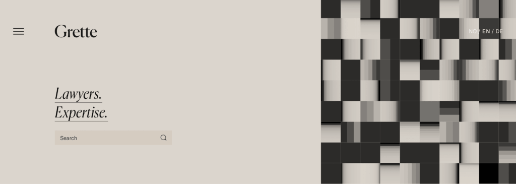
Check out this example from the law firm Grette: they know exactly what users of their site are looking for (experienced lawyers!) They provide it right away with simple but effective language, a clean palette, and a search bar. Nothing else needed!
2. Pops of Color
Less-is-more notion of minimalism includes color. We’ll see fewer noisy layers and bold designs that are striking but simple. The best way to nail “striking but simple” is to give a pop of color.
From examples we’ve seen, it looks like primary colors are ready to trend again. Additionally, you’ll see a lot of earthy tones, as our society focuses more on sustainability and climate preservation. Look for a mix of nature-inspired hues with basic primary colors as accents.
One color that we’re already seeing as a pop is red. In the past, people avoided red, as it can be hard on the eyes. But just like a little pop of a red lipstick, a red title or accent can be striking to grab attention. Plus, with more experimentation in shades and tones, red can be incorporated in unique ways that look harmonious, not overwhelming.
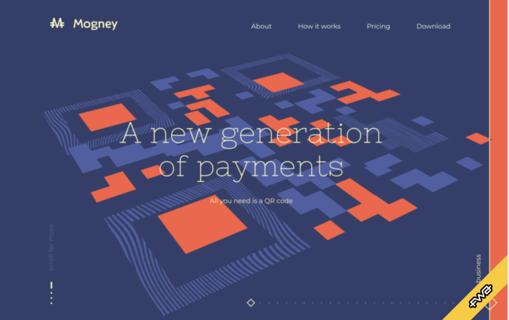
Take a look at Mogney, a digital currency company. The striking use of red emphasizes their QR code, which is the basis of their company. It creates a bold yet still minimal theme that pairs well with the blue background for an attractive look.
3. Symmetrical layouts
Since we’re seeing lots of simplicity this year, web design trends in 2022 will also inspire symmetrical looks. Think of split pages and grid layouts, and even balances of imagery and text. With web pages divided into content blocks, it can help your brand chunk up your story in tangible ways.
We also predict lines being used in a new way: thick and thin borders will divide sections, menus, and screens. This will create balance to help your website appear neat and orderly.
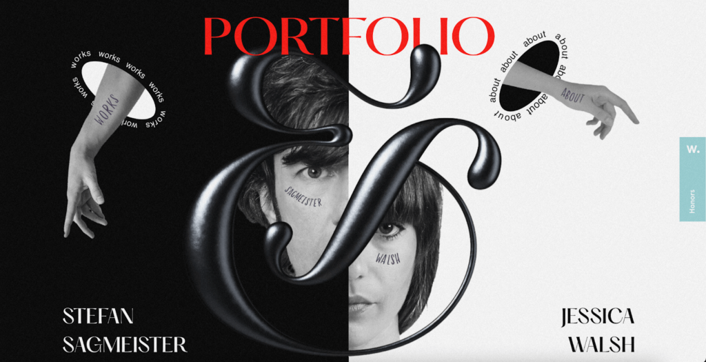
One benefit of symmetrical layouts is how it can draw the reader’s eye to specific information. Take this Swedish photography studio example from Sagmeister & Walsh. In addition to using red for a striking title, the page is split into two to embrace the joint efforts of the two artists. The collaboration here comes out naturally in the design, with the giant ampersand providing a striking visual mark over the split page.
4. Serif typography
As a juxtaposition to sleek, modern fonts, serif fonts are making their way back into web design. Serif typefaces are those that have a tip at the edge of the letter’s shape. Think of Times New Roman, Garamond, and Georgia as examples of serif fonts. As we look around, we see more brands taking advantage of the elegance these fonts have to offer. Serif typefaces also remind us of reading print, which brings a classic feel to this design choice.
We’ll see more websites embracing lightweight serif fonts with one of two big striking phrases as a focal point. Some designers will cover the fold of a website with one word or phrase, using a lightweight font over an image to balance this aesthetic.
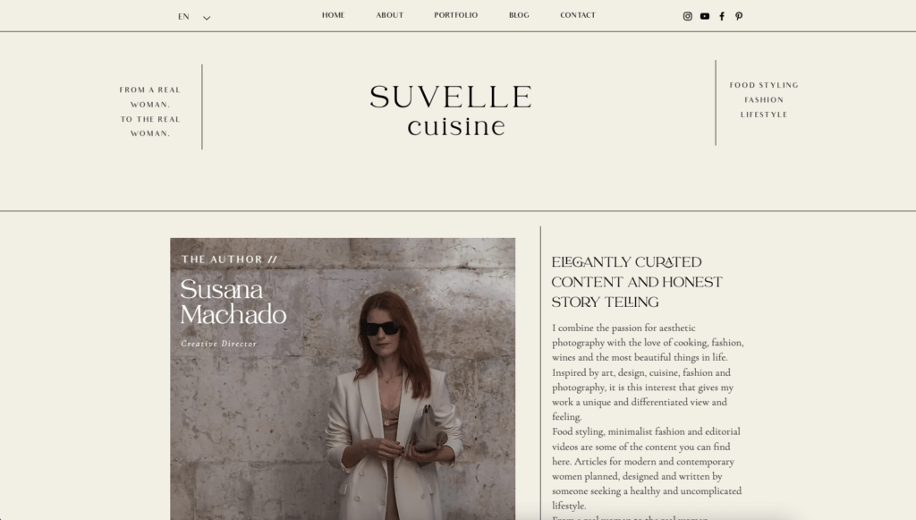
Suvelle Cuisine is one site already using the Serif trend combined with some minimalism (and line borders!) to create attractive, sophisticated text blocks on their website.
5. A 90’s aesthetic
Repeating trends are not just for the fashion world – they make their way into website design as well. As we’ve seen tons of 90s vibes crawl back into society, web design will see this trend as well. When remembering what was trending in the 90s, think vibrant color pops, various atypical shapes, and large text.
Though we are seeing many natural and primary colors being used, we’ll also see stylish neon palettes work their way in to add a fun edge without being the leading look. A 90s pop may come out as a bright accent or small colorful lines to make the composition catchy.
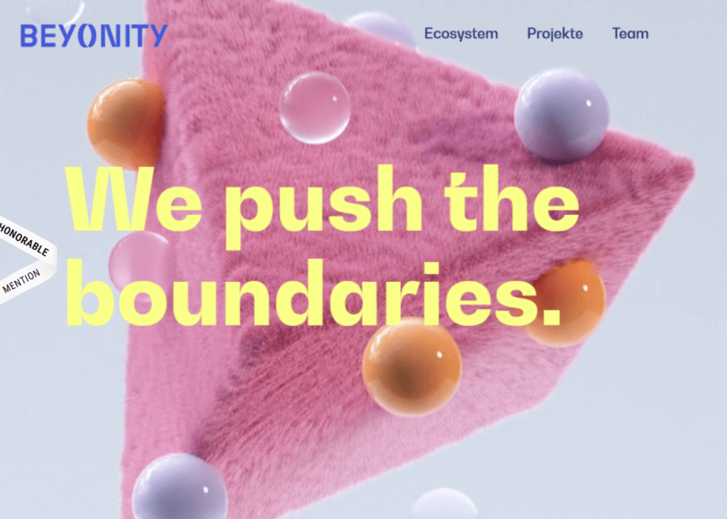
Look at German site Beyonity – by embracing of asymmetrical shapes and bright colors, their website just screams early 90s.
6. Large buttons with simple calls to action
No matter your design palette, your button size matters. You always want a button to be the thing that users can spot easily. Of course, this translates into large buttons that are clearly labeled. (Plus, large buttons are good for accessibility!)
When thinking of large buttons, consider a simple call to action that intrigues the user to make a meaningful click. Not only should the look of your text be striking, but the phrase should be meaningful, too! We’ll see even more innovation in how designers and marketers are creating relevant, intriguing, and action-inspiring CTAs paired with a meaningful big button click.
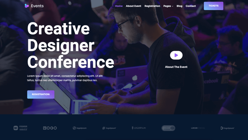
Look at this events website starter template from Kadence WP. Not only are they using gradient color in an exceptional way, but paired with a big, action-inspiring button to click.
7. Authentic, inclusive photography
Just because your site is for business, doesn’t mean it can’t be inspiring. Often, we see a lot of websites using the same imagery and cheesy stock photos. Think: high-fiving with over-exaggerated smiles, stylish groups looking at the camera, executives wearing superhero costumes, groups of people jumping in the air. No thanks!
Look instead for photos that depict realistic scenes with real-looking folks. Look for candid images in real-world settings rather than studios. Inclusivity is the new normal, both in and outside the web design world, with more brands embracing images that speak to diverse backgrounds, races, and ages and emphasize inclusivity.
Websites in 2022 should include images representing individuals from all walks of life: diverse skin tones, body types, ages, disabilities, and more.
Take clothing brand Big Bud Press. One look at their homepage, and shoppers know that their website not only embraces, but promotes, inclusivity and representation (not to mention a killer use of font and color!)

8. Complicated animation
With improvements to website functionality, simplistic sites can also embrace movement in their design. Features like “scrollytelling” and animation are not going anywhere yet and still have a place among minimal design. In fact, there’s no better way to establish a sleek by striking style than using animated website interactions.
In 2022, we’ll see website designers using movement as a tool for drawing attention, but what’s truly trendy is using this animation to achieve a minimalistic and unexpected web design.
Animation has many uses in a minimalistic design. Information can be hidden behind visual elements until a visitor hovers over and reveals it. This is the equivalent of opening a cabinet door: it can help maintain a clean layout and rewards peeking around. Animation allows pages to be more minimalistic, but still dynamic. Think of clean movements and a goal of consuming information easily.
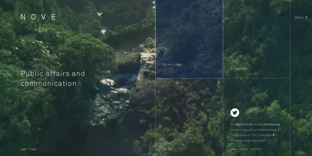
Take the company Nove, for example. Their website features a unique design with a fullscreen video background, transparent menus, and custom page templates for the different sections. Clicking in each of their boxes offers a different animation effect and makes exploring their website fun and attractive.
9. Video, video, video
If you spend any time on the web, you know that there’s videos at almost every corner. With social media pushing more video content through stories and similar features, we expect videos to continue trending all over the web. One way we’re seeing this in web design are video backgrounds, where a reel plays as users scroll over your website. This brings a certain life to your site that is simply not achievable any other way.
Plus, it has never been easier to create video content for your website, with all of us carrying a camera in our pockets with easy ways to point and shoot. There are so many tools and apps that allow you to quickly film, add effects, apply filters, and publish on the web.
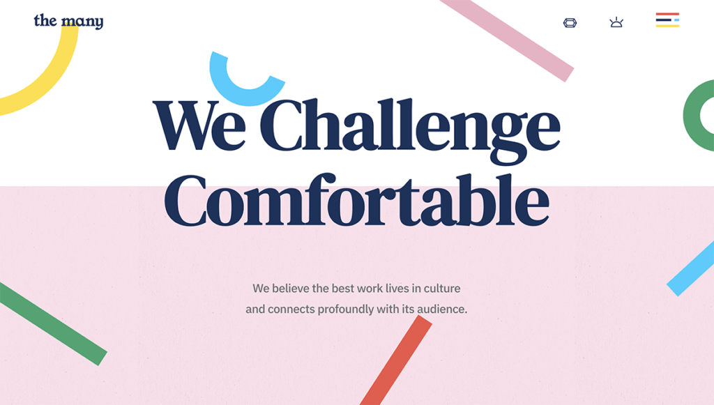
10. Abstract shapes
In line with the return of the 90’s aesthetic, we continue to see abstract shapes abound as design elements, header backgrounds, photo frames, and more. These playful shapes can also be fun when animated or given scrolling movement.
In this example from The Many, an advertising and creative agency, you can see many of the trends from 2022 implemented, from bold pops of color to serif fonts to complicated animation.
A Note on Design + Accessibility in 2022
Accessibility is surely not a new kid on the block. The web should always be accessible to everyone. Accessibility means that there are no barriers that prevent interaction with, or access to, websites by those with physical disabilities, situational disabilities, and socio-economic restrictions on bandwidth and speed.
Of course, building a website with accessibility requires some effort and know-how, but more and more websites are making sure accessibility is a key component of every design decision and not an afterthought.
In 2022, we can expect more and more businesses paying attention to accessibility. Incorporating analysis tools for accessibility, like Google Lighthouse, will become a norm of web development. Be prepared for accessibility checks along the way. This is one of the appealing aspects of minimalism: a clean, easy-to-read website is already ahead of the curb for accessibility.
Accessibility should be fully embraced and considered at every step of the design phase. If any of the above trends compromise accessibility, consider this implication first and plan accordingly to make sure your website is, above all, useful.
Final Thoughts
Whatever your website expertise is, these tips and examples may get you itching to get back into designer mode ASAP. Innovating and experimenting can help you stay fresh, show your growth, and most importantly, increase those conversions.
You can go with just one idea from the list above or think about how you can try out all of them! The most important thing is to tend to your site often and pay attention to how new features attract more customers.
Remember, building your website is just the beginning of your journey. Look into data, analyze your site, and look around you: be inspired by the thousands of creative, innovative websites being built every day.
Get SolidWP tips direct in your inbox
Sign up
Get started with confidence — risk free, guaranteed
Join us for the next Solid Academy Webinar!
Free weekly webinars that will help you master WordPress and increase your business's bottom line.
What is a WordPress Phishing Attack?
Learn how to identify and prevent phishing attacks on WordPress websites.
Kiki SheldonWebsite Protection: 5 Ways to Keep Your Website Safe
Robust website protection is the shield that stands between your business and relentless cyber attacks. Prioritizing website protection enables businesses to fortify defenses to safeguard their online presence and preserve the trust of their customers in the face of ever-evolving cybersecurity threats.
Kiki Sheldon23 Ideas To Grow Your WordPress Business in 2023
WordPress is the most popular website-building platform worldwide, trusted by numerous brands. WordPress enables you to build a user-friendly and highly reliable site, together with tools and plugins to enhance your marketing and work like a lead magnet. All these features make WordPress the platform chosen by more than 43% of businesses globally.
SolidWP Editorial TeamSign up now — Get SolidWP updates and valuable content straight to your inbox
Sign up
Get started with confidence — risk free, guaranteed
