5 Web Design Trends for November 2022
What are you doing differently with your WordPress web design this month? One of the biggest trends for November (pretty much every year) is the addition of holiday-themed design elements. (That’s the trend that will kick off our roundup.) Here are five great trends to consider this month: 1.

What are you doing differently with your WordPress web design this month? One of the biggest trends for November (pretty much every year) is the addition of holiday-themed design elements. (That’s the trend that will kick off our roundup.)
Here are five great trends to consider this month:
1. Holiday-Themed Elements
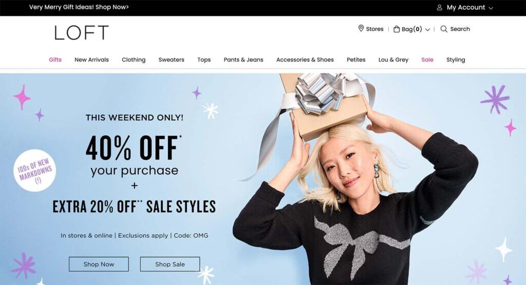
With the holidays quickly approaching, one of the biggest design trends this month is adding elements to encourage holly and jolly feelings. You can do this with color, language, or other design elements that evoke the holiday spirit.
Here, Loft uses holiday language in the top banner and the hero image and cute snowflakes to feel seasonal without too much of a Christmas look. This is a great option in the early holiday season so that the aesthetic doesn’t get too “gifty” too early.
2. Bold Color Blocks
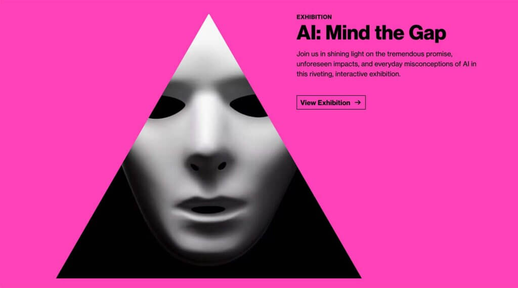
Big, bold color is a design trend that we can’t get enough of. These colors demand attention and are so engaging that you can’t help but dive into the design.
The latest iteration of this color trend focuses on color as a background element. And the brighter, the better.
MIT Museum uses multiple large color blocks to separate different content elements. This use of color is ideal for a creative space and helps highlight the art in various ways. The color blocks also are great for keeping everything contained in an organized manner and provide a highly readable background for text elements.
3. Holiday/Gifting Quizzes
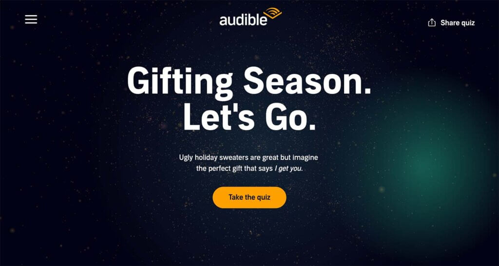
This design trend combines holiday elements and content to create a cool user journey that helps you find a gift and keeps you shopping for an extended period of time. Quizzes are a great way to showcase various products or services and keep users on your website longer.
Audible has created a nifty – and short – quiz with simple animations and design elements that aren’t too complex while encouraging users to move forward. Plus, the design feels on-brand with other Audible website designs.
4. Avatar Portfolios
For a while, it seemed like every portfolio website featured a portrait. This can be an intimidating design trend for those who don’t want their image to be the focus of their website design. For that reason, it’s refreshing to see that there’s a shift from images to avatars.
Designing an avatar for a portfolio website is a fun way to show your personality and likeness without a true photo. It also gives you one more opportunity to highlight your creative side with a custom-designed element. Just take a look at the example from Simona Nikola.
5. Designed Hiring Pages
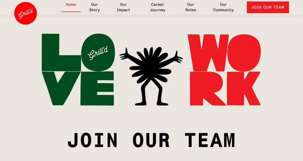
It seems like everyone is hiring these days, so it is no surprise that more websites are designing custom hiring pages that better showcase why you might want to work for a certain company.
Many of these pages feature the best aspects of work and plenty of fun images of the team.
Grill’d has those images below the scroll but leads with words that make you want to know more about jobs with them: Love Work. Those two words – especially with the fun design – make you want to know more about what to love.
This is also quite a shift from the career pages on many websites, which feature a list of positions and links to apply. This much more inviting option is likely to convert more applicants.
Putting it All Together
WordPress web design trends are a fun element but don’t feel like you have to try every new trend that comes along. Pick the ones that are right for your website and brand to keep it feeling fresh and modern.
Join us for the next Solid Academy Webinar!
Free weekly webinars that will help you master WordPress and increase your business's bottom line.
What is a WordPress Phishing Attack?
Learn how to identify and prevent phishing attacks on WordPress websites.
Kiki SheldonWebsite Protection: 5 Ways to Keep Your Website Safe
Robust website protection is the shield that stands between your business and relentless cyber attacks. Prioritizing website protection enables businesses to fortify defenses to safeguard their online presence and preserve the trust of their customers in the face of ever-evolving cybersecurity threats.
Kiki Sheldon23 Ideas To Grow Your WordPress Business in 2023
WordPress is the most popular website-building platform worldwide, trusted by numerous brands. WordPress enables you to build a user-friendly and highly reliable site, together with tools and plugins to enhance your marketing and work like a lead magnet. All these features make WordPress the platform chosen by more than 43% of businesses globally.
SolidWP Editorial TeamSign up now — Get SolidWP updates and valuable content straight to your inbox
Sign up
Get started with confidence — risk free, guaranteed

