5 Web Design Trends for October 2022
New month, new web design trends to explore. We are totally loving some of the new twists on common and practical ideas that result in modern and sleek interfaces for WordPress website projects. Here are five great trends to consider this month: 1. Sleek Sliders Sliders are a design element that has been around for a while.

New month, new web design trends to explore. We are totally loving some of the new twists on common and practical ideas that result in modern and sleek interfaces for WordPress website projects.
Here are five great trends to consider this month:
1. Sleek Sliders
Sliders are a design element that has been around for a while. Homepage hero sliders are popular because they provide an opportunity to show multiple pieces of content with unique calls to action.
The challenge with sliders is that they often end up with a “look” that almost screams “this is a slider.” Not anymore.
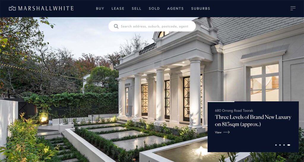
These new sleek slider designs look more like traditional hero images but then have a slide effect.
Note how Marshall White uses this effect. One of the tricks that makes this look less like a traditional homepage slider is that all of the slide tools are tucked in the text box so that the image is left alone. They also do a great job layering elements in a way that’s engaging and interesting.
2. Interesting Grids
The grid is a strong basis for any design. It helps you create organization and function for the overall design so that every element has a place, from photos to animations to text and calls to action.
Most of the time, you don’t really see the grid in a design project, but sometimes when you do, it can be pretty cool.
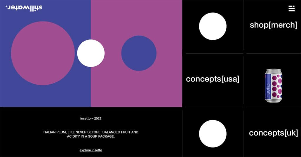
Stillwater is showing you its grid with a highly animated design that moves pieces in and out so you can almost see the grid in action. It’s a short-scroll website, with not much more than the footer below the hero area. But for some reason you find yourself caught in the design and looking for a while.
The organization and the planned motion are quite stunning.
3. Unusual Imagery
An unexpected picture or illustration can draw people into a website design quickly and help them stay if they want to better understand the content. The best unusual imagery is often an unexpected twist on something you might expect.
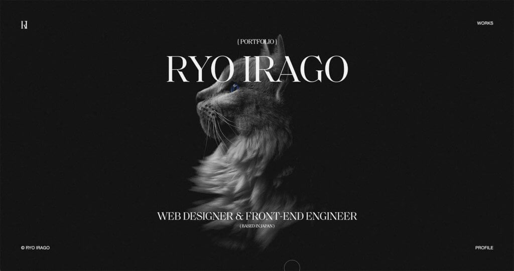
In the portfolio example from RYO IRAGO, the designer replaces the image of himself with a cat. The photo is in the same style and manner as a human portrait might be. There’s also the fun element of the blue eyes.
This makes you stop, look, and think about the design. It’s exactly what unusual imagery is supposed to do.
4. Big Buttons
Could those buttons get any bigger? (We hope so!)
Big, bold call-to-action buttons are a must-have design element on websites that want users to interact with content quickly.
The trick is to pick something you want users to do and go all in with oversized elements that you can’t miss.
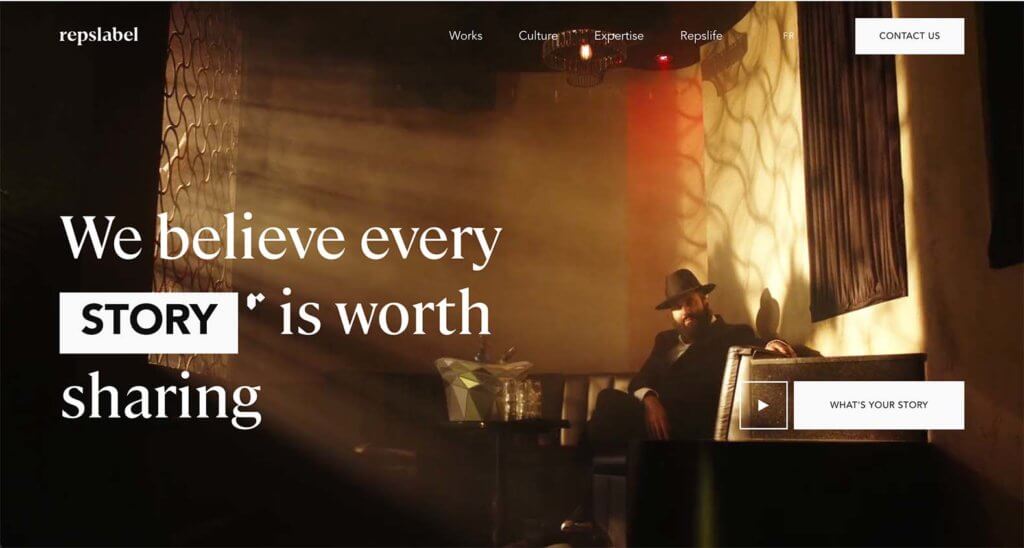
Replabel uses two big buttons here. One for contact us in the main navigation and another in the hero content, “What’s Your Story?”
Both buttons are large and have an impact as well as use microcopy that instills a sense of engagement and belonging for the user. The website wants to know what the user thinks. It is an inviting interaction that feels warm.
5. “No Click” Sales
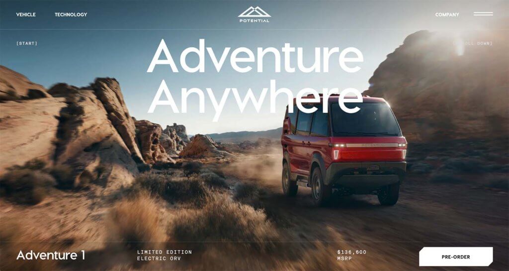
An emerging trend in online sales and shopping is to eliminate clicks. Remember when you would visit a website, find a product, and have to navigate a couple of clicks to see pricing? This design trend gives you all the information up front to make a buying choice.
The “no click” sales approach is a little risky because the user gets pricing upfront before you have the extra opportunity for the sale. But it can have a great payoff in ease of use.
Potential does this here with their vehicle with pricing right on the homepage and a button to pre-order. To get more information, you dig a little deeper.
For the shopper in the market for this product, they probably already know why they are here and what they want, making this approach a good idea. It’s quicker and easier to complete the pre-order process.
Putting it All Together
WordPress web design trends are a fun element but don’t feel like you have to try every new trend that comes along. Pick the ones that are right for your website and brand to keep it feeling fresh and modern.
Join us for the next Solid Academy Webinar!
Free weekly webinars that will help you master WordPress and increase your business's bottom line.
What is a WordPress Phishing Attack?
Learn how to identify and prevent phishing attacks on WordPress websites.
Kiki SheldonWebsite Protection: 5 Ways to Keep Your Website Safe
Robust website protection is the shield that stands between your business and relentless cyber attacks. Prioritizing website protection enables businesses to fortify defenses to safeguard their online presence and preserve the trust of their customers in the face of ever-evolving cybersecurity threats.
Kiki Sheldon23 Ideas To Grow Your WordPress Business in 2023
WordPress is the most popular website-building platform worldwide, trusted by numerous brands. WordPress enables you to build a user-friendly and highly reliable site, together with tools and plugins to enhance your marketing and work like a lead magnet. All these features make WordPress the platform chosen by more than 43% of businesses globally.
SolidWP Editorial TeamSign up now — Get SolidWP updates and valuable content straight to your inbox
Sign up
Get started with confidence — risk free, guaranteed

