5 Web Design Trends for September 2022
Our three favorite things about fall: Pumpkin spice lattes, sweaters, and new design trends. This is the time of year for new techniques in website design as people get back into their routines following summer vacations and breaks, and it shows in the work. Here are five great trends to consider this month: 1.

Our three favorite things about fall: Pumpkin spice lattes, sweaters, and new design trends. This is the time of year for new techniques in website design as people get back into their routines following summer vacations and breaks, and it shows in the work.
Here are five great trends to consider this month:
1. Highlighting
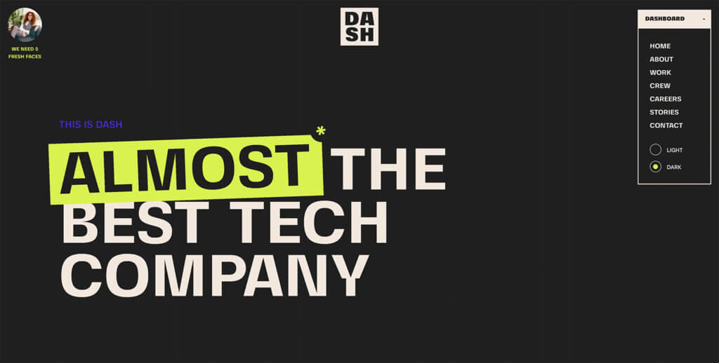
Much like when you highlighted content when studying for a test in school, highlighting in website design showcases key elements of the project. Highlighting can be in almost any color as long as there is sufficient contrast with the text and background and the words are readable.
What’s nice about the example here from Dash is that there’s a fun tilt and cut-in with the highlight. (Hover over that star element for a fun divot.)
You are immediately drawn to that part of the design and even read the words differently because of it. Highlighting is an effective technique when the text really matters.
2. Smartly Designed Cards
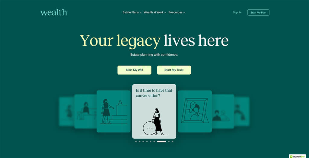
You know a well-designed card from a poor one almost the minute you come across it.
When a card design works, you want to flip through them, engage with the content, and see what’s therein. When they are poorly designed, there just seems to be a jumble of information on the screen.
Wealth features well-designed cards. They are simple and engaging, and you want to see what’s on each one. Just check out the example from Wealth. It’s a practical way to dig into heavy and complicated content.
3. Overlapping Elements Between “Scrolls”
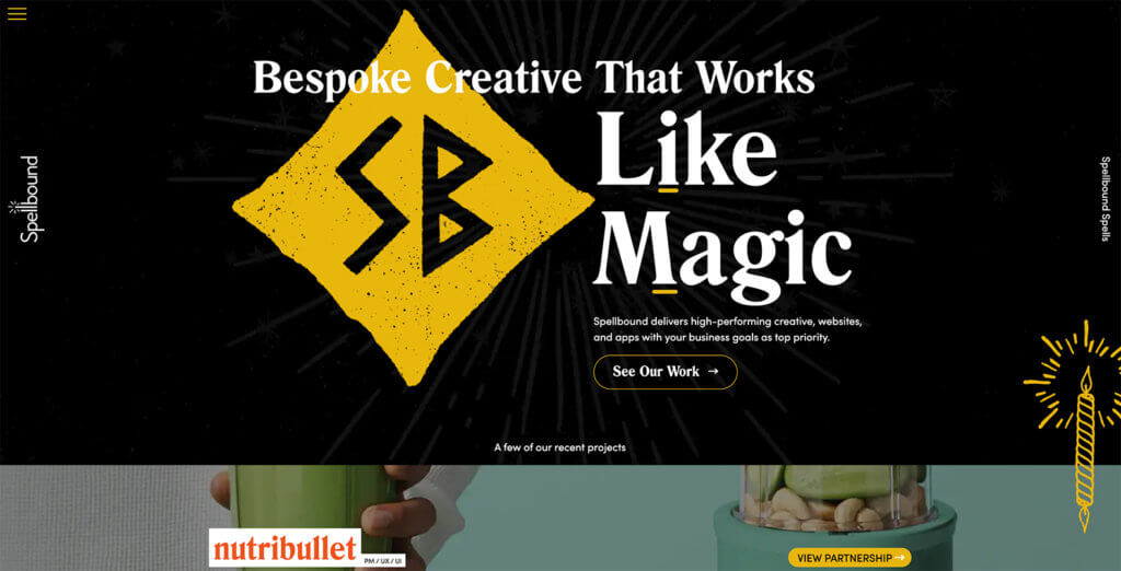
Designers are starting to pay more attention to getting users from the hero header of a website to below the scroll. There’s been a focus on big, bold headers for a while, and while beautiful, they don’t always encourage users to move down the homepage.
This design trend works to remedy that with small elements that help direct the eye and mouse down the screen. Elements seem to overlap between two scrolls or screens at once, providing a cue that there’s more to explore.
Such as in the example above from Spellbound, light animation or motion with these elements can help draw attention and encourage screen movement.
4. Merging Elements for Impact
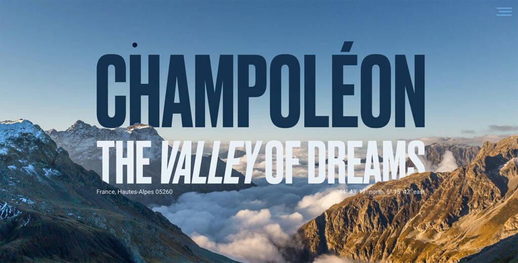
Combining text and images is something that happens in most website designs. In this trend, the images, and text and merged in a way that makes them appear to be a single element on the screen.
In the example from Champoleon, the words seem to be rising out of the mountains and horizon. Text elements are layered in front of and behind parts of the image. It looks seamless and beautiful. The elements are connected in a way that’s quite stunning.
This high-impact design works well with just the right content and should be planned out to ensure you get the feeling you are working toward.
5. Better Online Brochures
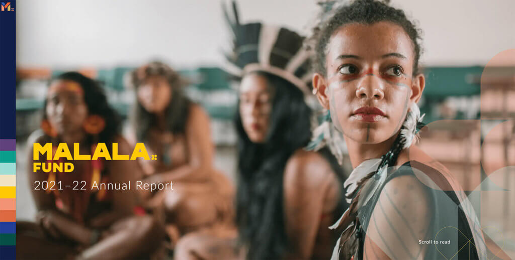
Many websites that are designed to be online brochures still just look like websites.
In the example from Malala above, the website looks, feels, and functions like an actual brochure. The “pages” turn, and you get content in the way the designer intended. This is a really different concept and a design trend that we’d love to see more of for this kind of content. (Click through to experience this design trend in action.)
This design trend features big imagery, stunning text, and quite a bit of content (from text to numbers) to tell a story. What sells it is the look and feel that is so reminiscent of a printed brochure that you engage with it longer and deeper because of that interactive element.
Putting it All Together
WordPress web design trends are a fun element but don’t feel like you have to try every new trend that comes along. Pick the ones that are right for your website and brand to keep it feeling fresh and modern.
Join us for the next Solid Academy Webinar!
Free weekly webinars that will help you master WordPress and increase your business's bottom line.
What is a WordPress Phishing Attack?
Learn how to identify and prevent phishing attacks on WordPress websites.
Kiki SheldonWebsite Protection: 5 Ways to Keep Your Website Safe
Robust website protection is the shield that stands between your business and relentless cyber attacks. Prioritizing website protection enables businesses to fortify defenses to safeguard their online presence and preserve the trust of their customers in the face of ever-evolving cybersecurity threats.
Kiki Sheldon23 Ideas To Grow Your WordPress Business in 2023
WordPress is the most popular website-building platform worldwide, trusted by numerous brands. WordPress enables you to build a user-friendly and highly reliable site, together with tools and plugins to enhance your marketing and work like a lead magnet. All these features make WordPress the platform chosen by more than 43% of businesses globally.
SolidWP Editorial TeamSign up now — Get SolidWP updates and valuable content straight to your inbox
Sign up
Get started with confidence — risk free, guaranteed

