6 Web Design Trends for August 2022
Most commonly, people think of web design trends as visual elements, but trends can also include a lot of function. The best trends probably have a little of both. Here are six great trends to consider this month: 1. Customized Product Pages This is a functional design trend that also looks so good: More designers are branching out from the traditional WooCommerce product pages that are seemingly everywhere for more customized options.

Most commonly, people think of web design trends as visual elements, but trends can also include a lot of function. The best trends probably have a little of both.
Here are six great trends to consider this month:
1. Customized Product Pages
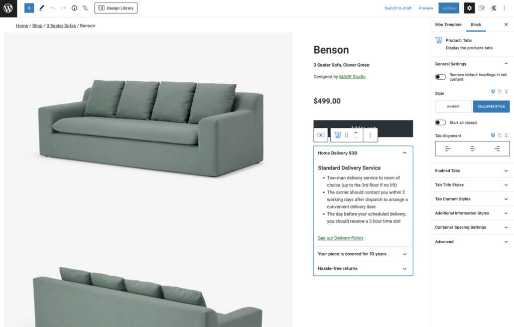
This is a functional design trend that also looks so good: More designers are branching out from the traditional WooCommerce product pages that are seemingly everywhere for more customized options. This example comes to us from Kadence WP.
A more custom product page allows you to use all the powerful features of WooCommerce with a design that looks and feels like you. The new version of Kadence Shop Kit 2.0 provides the opportunity to customize product page layouts in any way you can imagine.
You can create a trending design using the Kadence tools you already know with a drag and drop builder.
2. Distraction-Free Checkout
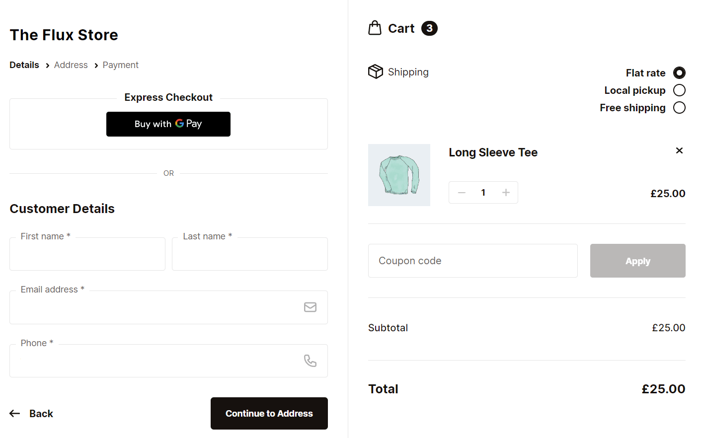
Simplifying checkout pages is backed by research that shows that 17% of potential customers abandon carts at checkout due to the checkout process being too long and complicated. (Read more about reasons for WooCommerce cart abandonment and how to fix them.)
To help create a distraction-free checkout experience, consider how you can simplify the checkout experience by creating a step-by-step, multi-page checkout. Flux Checkout for WooCommerce does a lot of this work for you with a layout that is easy for customers to understand and super fast – helping them checkout with ease.
Even better, Flux Checkout just released a new theme called Modern. The new Modern theme is simple and clean, with a stylish vibe. Modern is multi-step, lightning fast, and designed to prevent abandoned carts.
3. Better Career Portals
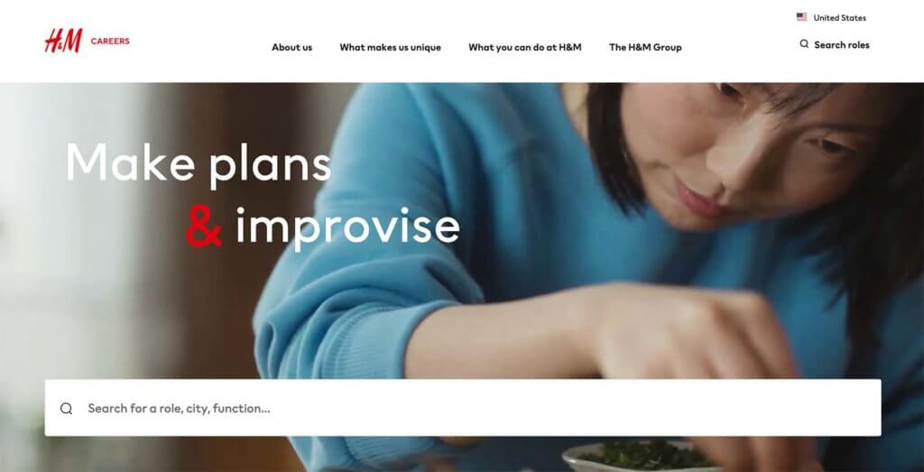
We all know that jobs and hiring are a big deal right now. So it was only a matter of time before companies started doing a better job with the design and functionality of career portals.
These sites have traditionally been listed with a lot of words and not a lot of visuals or functionality. Browse the list and apply. That was it.
This new breed of career sites is more engaging with video and great content, as in the example above from H&M. They include imagery and information that makes you want to work for a company. Bonus features like search or easy applications are the cherry on top.
4. Beautiful Shopping Pages
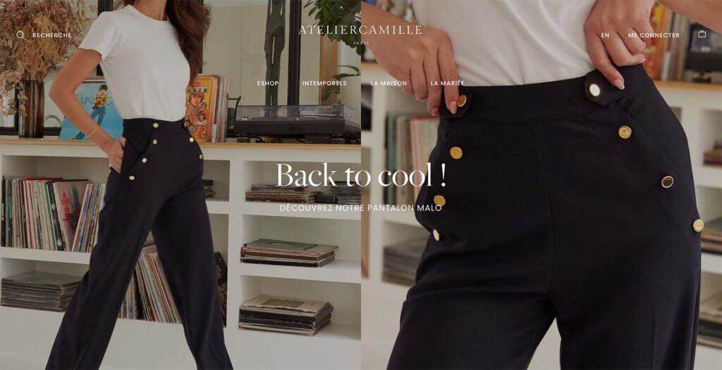
Online shops are getting better looking all the time. This applies to imagery as well as functionality. You are more likely to buy something from an online store if it looks great and is easy to use. You can see this in action at Atelier Camille.
More online storefronts are moving to bigger images with more detail and environmental elements so that you can picture yourself in what is being sold – from clothing to gadgets to furniture.
5. Light Gamification
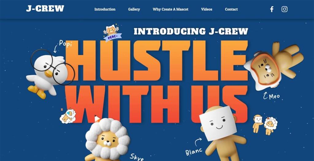
There was a time that heavy gamification was a primary driver of creating online interactions. While gamification – creating game-like experiences to create sustained engagement – hasn’t gone away, it is a lot less involved with a lighter feel.
Light gamification includes website designs and interactions that only take a few minutes to complete rather than a longer duration. Users get the immediate satisfaction of completing a challenge or interaction with a reward at the end.
The functionality, like in the example from J-Crew, is often paired with lighter, even cartoonish, imagery to create a more childlike experience that can take users out of the “real world” for a minute to engage online.
6. More Accessible Video
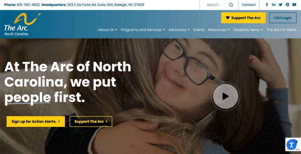
Forget all that auto-play video. More accessible video is in.
What does that mean?
Video that starts stopped and has a play button that the user controls. Accessible video playback is just one element of more accessible video content online. The other elements include using video captions (vital for users with screen readers), using video transcripts, and creating audio descriptions and alt tags for audio content. Just check out this example from The Arc North Carolina.
Using any of these elements in the design can help your content be more accessible to more people. It’s more than a trend, it’s becoming a necessity.
Putting It All Together
WordPress web design trends are a fun element but don’t feel like you have to try every new trend that comes along. Pick the ones that are right for your website and brand to keep it feeling fresh and modern.
Join us for the next Solid Academy Webinar!
Free weekly webinars that will help you master WordPress and increase your business's bottom line.
What is a WordPress Phishing Attack?
Learn how to identify and prevent phishing attacks on WordPress websites.
Kiki SheldonWebsite Protection: 5 Ways to Keep Your Website Safe
Robust website protection is the shield that stands between your business and relentless cyber attacks. Prioritizing website protection enables businesses to fortify defenses to safeguard their online presence and preserve the trust of their customers in the face of ever-evolving cybersecurity threats.
Kiki Sheldon23 Ideas To Grow Your WordPress Business in 2023
WordPress is the most popular website-building platform worldwide, trusted by numerous brands. WordPress enables you to build a user-friendly and highly reliable site, together with tools and plugins to enhance your marketing and work like a lead magnet. All these features make WordPress the platform chosen by more than 43% of businesses globally.
SolidWP Editorial TeamSign up now — Get SolidWP updates and valuable content straight to your inbox
Sign up
Get started with confidence — risk free, guaranteed

