WordPress CSS Tricks: CSS Typography Mask, Clip Paths & More
Each time I build a new WordPress website, I learn a few CSS tricks and I want to share a few with you. When I build WordPress websites, I use iThemes Builder. All the CSS tricks and tips I show you here can be used in the stylesheets provided in your theme folder and with all Builder layout modules.

CSS Typography Mask
If you are familiar with Adobe Photoshop or Illustrator, you probably know a thing or two about clipping masks. This CSS technique is a lot like that.
First you’ll need a bit of HTML markup.
<div class="container">
 <!-- the element whose background we're going to clip -->
 <div class="clipped">
 <h1>Earth</h1>
 </div>
</div>
The important thing here is the class “clipped.”
If you’re using iThemes Builder, you can insert this into an HTML module in Layouts and Views.
 Now for the CSS. As I said before, we are focused on the class around the header — “clipped.” This will go into the appropriate stylesheet of your theme.
You will need an image to mask the text with. In this case my <h2> is “Earth” and I’m original, so I thought to mask that with an image of earth.
Now for the CSS. As I said before, we are focused on the class around the header — “clipped.” This will go into the appropriate stylesheet of your theme.
You will need an image to mask the text with. In this case my <h2> is “Earth” and I’m original, so I thought to mask that with an image of earth.
 .clipped {
background: url(.../img/earth.jpg) no-repeat center center;
background-size: cover;
background-size: 18%;
color: #fff;
text-align: center;
padding 2em;
-webkit-text-fill-color: transparent;
-webkit-background-clip: text;
}
Here we are using two -webkit tags to accomplish the desired effect.
-webkit-text-fill-color: transparent;
-webkit-background-clip: text;
These are what actually create the masked type effect. The -webkit- prefix is used for CSS properties not yet officially implemented either by the W3C specifications or by all web browsers, but are available to WebKit browsers.
Something to note: There is no need to have two background-size tags, but I wanted show you that you do have the option to set the size to “cover.” In this particular case I wanted to size the image manually. Both options are fine.
And waalaa!

Graphic Typography
Can’t get enough typography? I feel you.
Typography seems to be growing in popularity in the web design community. Designers are focusing more on content and exploring ways to highlight it on websites. Because of this, type seems to be emerging as a graphic element in addition to communication.
That said, let’s take a look at how to add a graphic touch to some type.
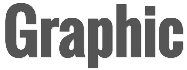
To begin we have our HTML. Once again this can be placed in an HTML module or even a widget module specific to text.
<div class="container">
     <h2>Graphic</h2>
</div>
 Pretty basic. Time to add some interest.
The CSS:
Pretty basic. Time to add some interest.
The CSS:
.container h2 {
 color: #555;
 font-family: 'Oswald', sans-serif;
 text-decoration: none;
 text-transform: uppercase;
 font-size: 200px;
 font-weight: 800;
 letter-spacing: -3px;
 line-height: 1;
 text-shadow: #EDEDED 3px 2px 0;
 position: relative;
}
 Now we add the pseudo element ::after. Notice the position on the h2 is relative, this is necessary for when we position our pseudo element absolute.
We have also added a bit of text shadow to our header, but it isn’t super visible at the moment.
Now we add the pseudo element ::after. Notice the position on the h2 is relative, this is necessary for when we position our pseudo element absolute.
We have also added a bit of text shadow to our header, but it isn’t super visible at the moment.
.container h2:after {
 content:"graphic";
 position: absolute;
 left: 10px;
 top: 10px;
 background-image: -webkit-linear-gradient(left top, transparent 0%,
transparent 25%, #555 25%, #555 50%, transparent 50%,
transparent 75%, #555 75%);
 background-size: 4px 4px;
 -webkit-background-clip: text;
 -webkit-text-fill-color: transparent;
 z-index: -5;
 display: block;
 text-shadow: none;
 text-align: center;
}
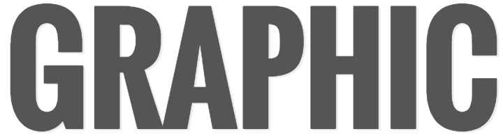
Now we have this. A much more interesting header.
 The text shadow breaks up the header from the pseudo element and once again we are using the prefix webkit for a couple of CSS tags.
Play around with different fonts and colors to see what kind of headers you can create.
The text shadow breaks up the header from the pseudo element and once again we are using the prefix webkit for a couple of CSS tags.
Play around with different fonts and colors to see what kind of headers you can create.
Creating a Triangle with CSS
Maybe I’m late to the party and everyone knows this one, but just in case there are any poor, clueless souls like me, I have to share.
I often find myself wanting to use an arrow (triangle) for various reasons. In these cases I would always create a triangle in Illustrator and use it as a background image in my CSS.
There is a better way.
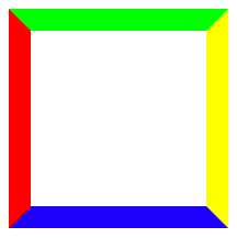
We have a square. 
width: 200px;
height: 200px;
border-left: solid 20px #f00;
border-right: solid 20px #ff0;
border-top: solid 20px #0f0;
border-bottom: solid 20px #00f;
Notice the borders meet at an angle.
Now set the width and height of the square to zero. 
width: 0px;
height: 0px;
background: transparent;
Now you have four different triangles, and all you need to do is choose the direction the triangle needs to be and set the other border colors to transparent. 
border-left: solid 20px transparent;
border-right: solid 20px transparent;
border-top: solid 20px transparent;
border-bottom: solid 20px #00f;
Boom. Triangle.
 .triangle {
width: 0;
height: 0;
background: transparent;
border-left: solid 20px transparent;
border-right: solid 20px transparent;
border-top: solid 20px transparent;
border-bottom: solid 20px #00f;
}
Breaking Photos “Out of the Box”
Photos are a great addition to any website. By adding a visual, a second layer of communication is added giving your message a little extra oomph.
The majority of photos are rectangle. We are going to look at how to use clip-path to change the shape of a photo.
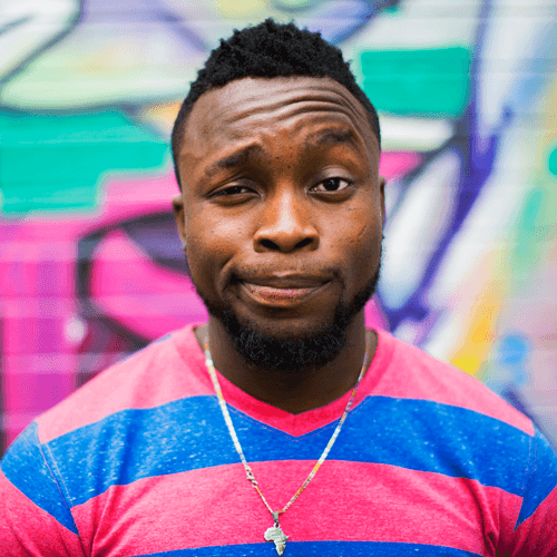
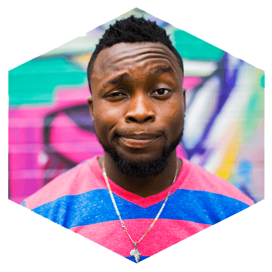
Let’s turn this photo into a hexagon.
 Notice my photo is a square. If you use the polygon points provided, you’ll want to use a square photo as well in order to not skew your hexagon.
The HTML:
Notice my photo is a square. If you use the polygon points provided, you’ll want to use a square photo as well in order to not skew your hexagon.
The HTML:
<svg class="clip-svg">
 <defs>
 <clipPath id="polygon-clip-hexagon" clipPathUnits="objectBoundingBox">
 <polygon points="0.5 0, 1 0.25, 1 0.75, 0.5 1, 0 0.75, 0 0.25" />
 </clipPath>
 </defs>
</svg>

<div class="polygon-each-img-wrap">
 <img src="https://saylor.dev.ithemes.com/wp-content/uploads/2017/02/
example-img.png" class="polygon-clip-hexagon">
</div>
Now the CSS:
.clip-svg {
 width: 0;
 height: 0;
 }

 img {
 max-width: 100%;
 height: auto;
 }

 .polygon-clip-hexagon {
 -webkit-clip-path: polygon(50% 0%, 100% 25%, 100% 75%, 50% 100%,
0% 75%, 0% 25%);
 clip-path: polygon(50% 0%, 100% 25%, 100% 75%, 50% 100%, 0% 75%,
 0% 25%);
 -webkit-clip-path: url("#polygon-clip-hexagon");
 clip-path: url("#polygon-clip-hexagon");
 }
CSS’ clip-path property allows you to shape things differently by changing different values. Hexagons, octagons, stars — think outside of the box.
Boom. Hexagon.
 You might be asking yourself how to come up with the different values for various shapes and Clippy has got you covered. Still you can set everything manually if you so choose.
For a detailed explanation of the
You might be asking yourself how to come up with the different values for various shapes and Clippy has got you covered. Still you can set everything manually if you so choose.
For a detailed explanation of the clip-path property checkout CSS Tricks.
Reminder: Because You Can Doesn’t Mean You Should
I have zero shame saying CSS brings a lot of joy to my life. Discovering all it can do is better than the season finale of Game of Thrones — Scratch that. Let’s not get crazy.
Even so, it’s necessary to use discretion with more advanced CSS like animations. It’s easy to get carried away and lose sight of what’s important — building a polished website focused on presenting content that is clear and user friendly.
[pullquote]Remember, just because you can, doesn’t mean you should.[/pullquote] If some CSS animation just adds clutter to a site and does nothing for the message, don’t use it.
Act on the side of caution when it comes to details vs. speed. I assure you the majority of users prefer speed over “special effects.”
 Now for the CSS. As I said before, we are focused on the class around the header — “clipped.” This will go into the appropriate stylesheet of your theme.
You will need an image to mask the text with. In this case my <h2> is “Earth” and I’m original, so I thought to mask that with an image of earth.
Now for the CSS. As I said before, we are focused on the class around the header — “clipped.” This will go into the appropriate stylesheet of your theme.
You will need an image to mask the text with. In this case my <h2> is “Earth” and I’m original, so I thought to mask that with an image of earth.

 Pretty basic. Time to add some interest.
The CSS:
Pretty basic. Time to add some interest.
The CSS:
 Now we add the
 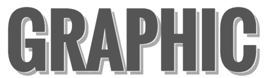 The text shadow breaks up the header from the pseudo element and once again we are using the prefix webkit for a couple of CSS tags.
Play around with different fonts and colors to see what kind of headers you can create.
The text shadow breaks up the header from the pseudo element and once again we are using the prefix webkit for a couple of CSS tags.
Play around with different fonts and colors to see what kind of headers you can create.

 Notice my photo is a square. If you use the polygon points provided, you’ll want to use a square photo as well in order to not skew your hexagon.
The HTML:
Notice my photo is a square. If you use the polygon points provided, you’ll want to use a square photo as well in order to not skew your hexagon.
The HTML:
 You might be asking yourself how to come up with the different values for various shapes and
 Join us for the next Solid Academy Webinar!
Free weekly webinars that will help you master WordPress and increase your business's bottom line.
What is a WordPress Phishing Attack?
Learn how to identify and prevent phishing attacks on WordPress websites.
Kiki SheldonWebsite Protection: 5 Ways to Keep Your Website Safe
Robust website protection is the shield that stands between your business and relentless cyber attacks. Prioritizing website protection enables businesses to fortify defenses to safeguard their online presence and preserve the trust of their customers in the face of ever-evolving cybersecurity threats.
Kiki Sheldon23 Ideas To Grow Your WordPress Business in 2023
WordPress is the most popular website-building platform worldwide, trusted by numerous brands. WordPress enables you to build a user-friendly and highly reliable site, together with tools and plugins to enhance your marketing and work like a lead magnet. All these features make WordPress the platform chosen by more than 43% of businesses globally.
SolidWP Editorial TeamSign up now — Get SolidWP updates and valuable content straight to your inbox
Sign up
Get started with confidence — risk free, guaranteed
