Landing Page Example: The Process and Reasoning
To create a successful landing page, you need a strategy and a process. In this post, we'll create a landing page example, and go over important landing page design elements. What is the Purpose of a Landing Page? Landing pages have a primary objective: to increase the chances of converting web traffic into leads.

To create a successful landing page, you need a strategy and a process. In this post, we’ll create a landing page example, and go over important landing page design elements.
What is the Purpose of a Landing Page?
Landing pages have a primary objective: to increase the chances of converting web traffic into leads.
There are generally two types of landing pages: Click-Through and Lead Generation.
- Click-through landing pages aim to persuade users to click through to another page, just as the name implies. This type of landing page is often used on ecommerce websites to describe a product in full detail.
- Lead generation landing pages’ goal is to collect data from users such as name and email in order to market to and connect with users in the future. There are a few ways to “encourage” people to share their information, such as offering an ebook or a free trial to a service or membership.
Building a Landing Page Example
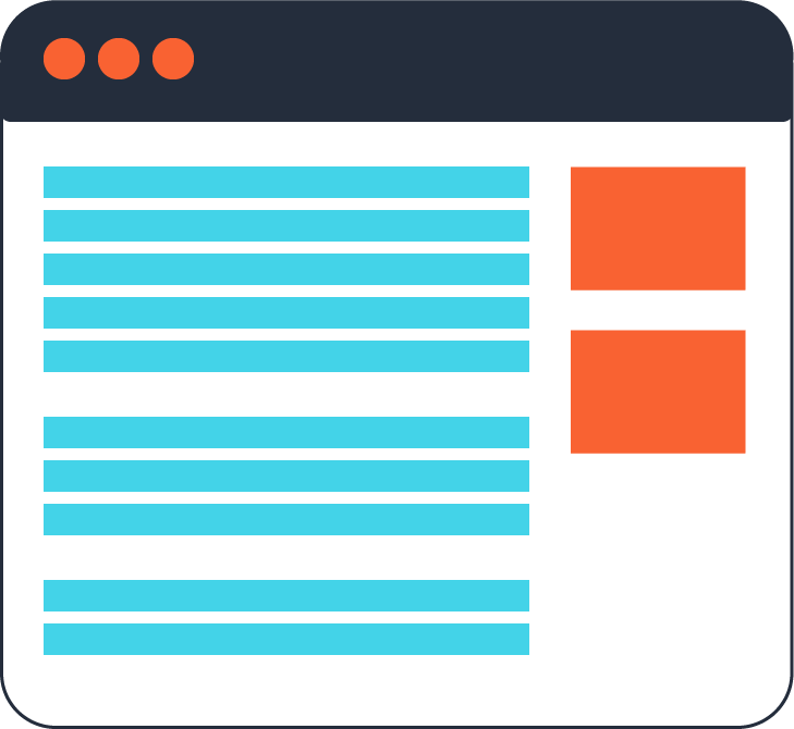
Regardless of the kind of landing page you use, there are certain elements successful landing pages need to have. This landing page example will act as a visual for the key areas discussed.
The Logo (and Logo Link) Matters
Placing the logo in the top left corner is the most common design pattern. Users are very familiar with this “landmark” placement and are 89% more likely to remember logos shown in this traditional position.
While linking the logo back to the homepage of the company website may be a habit, you may want to avoid making the logo a link. In my opinion, not linking the logo back to the primary website is the better option. [pullquote]The purpose of a landing page is to accomplish a goal, so don’t distract from that goal with unnecessary links.[/pullquote] Encourage visitors to focus on the message you want to communicate.
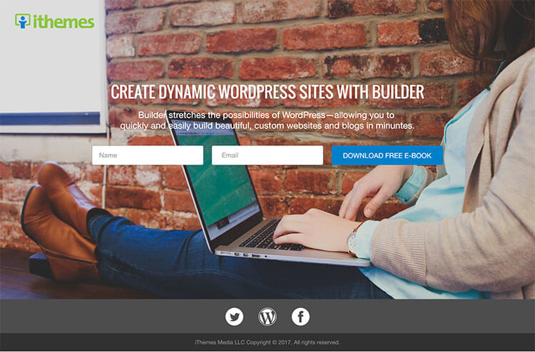
The following landing page example uses the familiar logo placement in the top left corner and is not linked to the homepage.
Remove Navigation Menus
Similar to not providing a way back to the primary website through the logo, navigation menus should be hidden. As you can see from the previous landing page example, there is no navigation menu displayed. This is optimal.
You have a goal and a message to communicate to visitors. Distracting them with other options and information prevents them from focusing on what’s important.
If there are minimal navigation links necessary to the message such as “Contact” or “Sign Up,” include them. Just remember to limit distractions.
A Clear, Concise Message
The headline should be attention-grabbing, bold and clear. Dig further into your message with a compelling subheading that communicates the key points. It should describe the “what” and “how.”
The headline and subheading on your landing page need to be “above the fold.” While this term is related to newspapers and print, the concept still applies to web pages. Visitors shouldn’t have to scroll to discover what the point is.

As you can see from the landing page example above, the heading and subheading are clear and concise, and the call-to-action button is above the fold.
If your landing page message is getting lengthy, take advantage of bulleted lists. Lists offer a way to break information down into bite-sized pieces.
Create an Effective Call-to-Action Button
A call-to-action (CTA) creates urgency and aims to persuade visitors to take a specific action.
[pullquote]A call-to-action should be specific and communicate exactly what you want a visitor to do.[/pullquote] Do you want them to learn, click, sign up, download, etc.?
The CTA placement is most advantageous above the fold, and it’s best to style it as a button (an obvious, clickable link). Your CTA button should be high-contrast and stand out from the rest of the page.

In this landing page example, the CTA button clearly communicates exactly what we want the user to do. It also uses the word “FREE,” a word everyone tends to be drawn to.
The Power of Imagery
Adding some sort of image or illustration can instantly make the page more interesting. Choose images with the intention of how they aid in the communication of the message.
[pullquote]Avoid cheesy photos that just take up space.[/pullquote] Photos invite creativity and interest into a design, so be strategic about your selection. Photos should be professional and relevant to the message in one way or another. They should clearly illustrate your message.
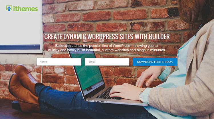
The image used in this landing page example hints that the person is either reading the e-book or using the product. Both are good messages to send. Additionally, she is looking down in the direction of the message, leading the user’s eye to do the same, and she looks relaxed, communicating a sense of ease.
Similarly, illustrations and/or graphics are effective visual tools.
Don’t over do it with competing images and graphics. Imagery should add value to the message, not distract from it.
Regardless of the type of imagery you choose to use, keep it simple and remember to use it to enhance the message.
A Minimalist Approach
Taking a minimalist approach to landing page design forces you to cut unnecessary elements and content. Minimalism enforces the need to create clear, concise messages as mentioned above.
A landing page is similar to an elevator pitch: a succinct and persuasive sales pitch.
Get to the point and tell people what you want them to do.
Avoid creating landing pages with a cluttered layout. [pullquote]Design should be strategic and intentional.[/pullquote] Know the reasoning behind why a certain picture draws more attention to the message, or how the color palette compliments the design.
Use Trust Signals
Trust signals turn visitors into buyers. While trust signals are often overlooked, their absence can impact the success of your landing page.
Features like reviews, testimonials, contact information, third-party certifications encourage trust.
[pullquote]Testimonials are often thought to be the number one feature to encourage trust.[/pullquote] Not only do they help build trust, testimonials also provide free advertising. Take advantage of adding testimonials to your message any chance you get.
Another way to inspire confidence is to provide your contact information. Social media links are another great way to connect to users and allow people to get to know your brand.

If you have them, third party certifications not only establish assurance, they communicate you are good at what you do.
Keep Forms Short & To The Point
Forms need to be short and only require essential information.
Asking for age, phone number or address will often turn people away, so avoid asking for any of that information.
Again, forms should also be placed above the fold. Visitors need to be able to see the entire form and all pertinent information without having to scroll.
Once a visitor has successfully submitted a form, use an effective thank you page with social media share buttons to show your appreciation and encourage them to share the offer with friends.
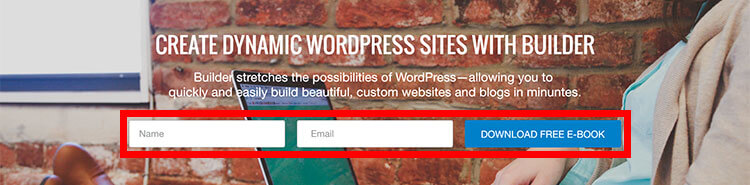
The form in this landing page example only requires the name and email. This makes completing the form quick and painless for the user …. and you will have another lead!
Mobile-Friendly, Y’all
It’s 2017 everyone. All facets of the web should be responsive. Make sure your landing page is mobile-friendly. Test on various devices to see how your landing page responds and to audit the user experience.
Go Create Your Own Killer Landing Page!
Start converting traffic into leads with killer landing pages. This is an opportunity to dramatically improve online marketing. Discover what a landing page could do for your business.
Get SolidWP tips direct in your inbox
Sign up
Get started with confidence — risk free, guaranteed
Join us for the next Solid Academy Webinar!
Free weekly webinars that will help you master WordPress and increase your business's bottom line.
What is a WordPress Phishing Attack?
Learn how to identify and prevent phishing attacks on WordPress websites.
Kiki SheldonWebsite Protection: 5 Ways to Keep Your Website Safe
Robust website protection is the shield that stands between your business and relentless cyber attacks. Prioritizing website protection enables businesses to fortify defenses to safeguard their online presence and preserve the trust of their customers in the face of ever-evolving cybersecurity threats.
Kiki Sheldon23 Ideas To Grow Your WordPress Business in 2023
WordPress is the most popular website-building platform worldwide, trusted by numerous brands. WordPress enables you to build a user-friendly and highly reliable site, together with tools and plugins to enhance your marketing and work like a lead magnet. All these features make WordPress the platform chosen by more than 43% of businesses globally.
SolidWP Editorial TeamSign up now — Get SolidWP updates and valuable content straight to your inbox
Sign up
Get started with confidence — risk free, guaranteed


