Top 5 Web Design Trends for March 2022
You can see that spring has sprung with some of this month’s trending web design trends. There’s a lot of color and visual interest that feels renewed and reborn – just like this time of year. Here are five great trends that will keep your WordPress website looking fresh. 1. Big Navigation Big, big navigation can help users get into your website design and better engage with content.

You can see that spring has sprung with some of this month’s trending web design trends. There’s a lot of color and visual interest that feels renewed and reborn – just like this time of year.
Here are five great trends that will keep your WordPress website looking fresh.
1. Big Navigation
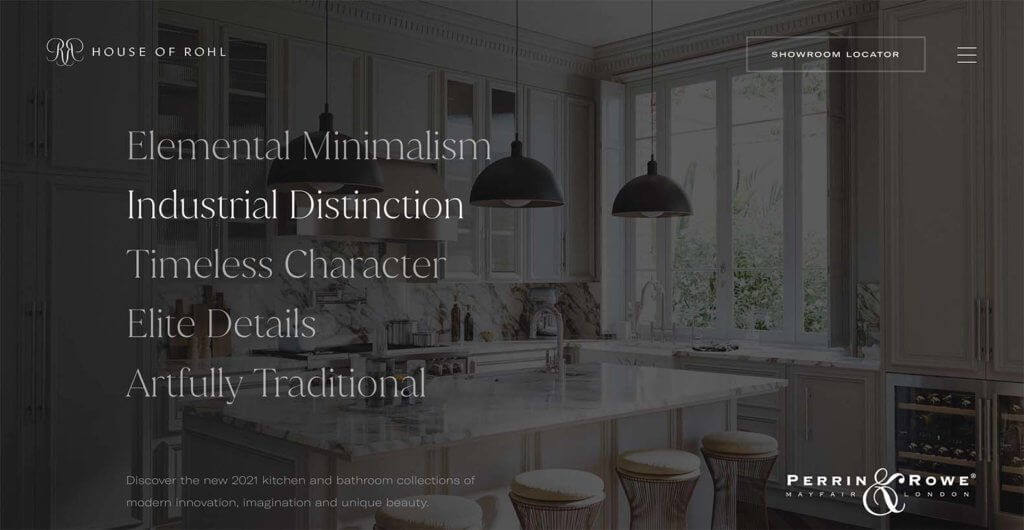
Big, big navigation can help users get into your website design and better engage with content. Just check out this example from House of Rohl.
There are two ways to try this design trend: With a hamburger menu that opens into a large menu or with the navigation elements right on the homepage. This style is a huge carryover from mobile websites and can have great functionality for a variety of purposes.
In the example here, the navigation is part of the home page design and is black until the user hovers over a section, which then brings in a background image.
2. Custom Footer Animation
A custom footer animation is a great way to draw users through the site design and even increase time on-site at the end of the scroll.
Plus, it is easy to do with the Kadence Lottie animation block in the free version of Kadence Blocks adds innovation to WordPress that no other free plugin offers: a no-code way to easily add animations to any WordPress site.
If this is a style you like – check out this tutorial for how to add a Lottie Animation to a Custom Footer. You’ll learn how to create your own Lottie animation for a cool custom WordPress footer design.
3. Backgrounds that Pop
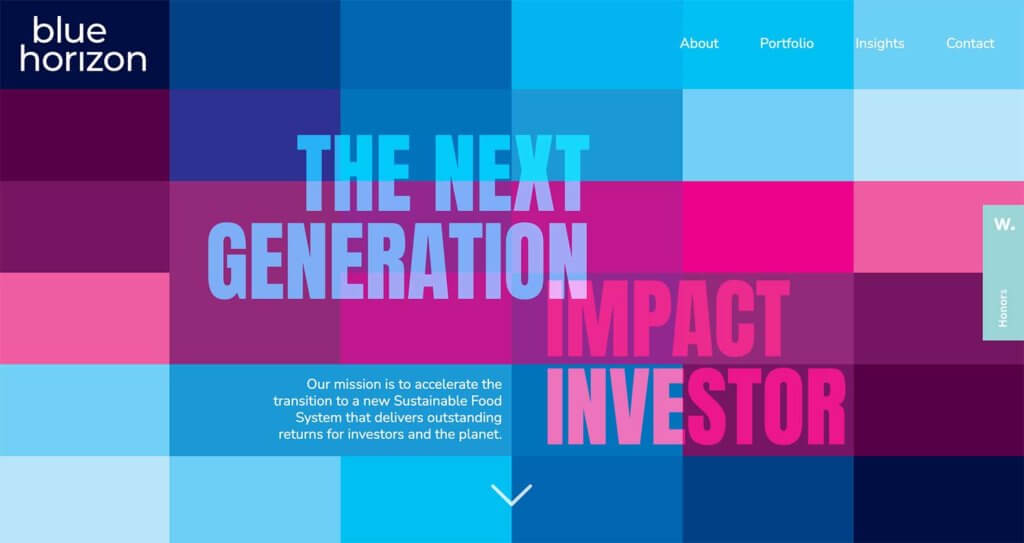
Background color, texture, or patterns can help a design without a lot of other images move to the next level. Color is an effective way to do this.
In the example from Blue Horizon, the design uses two colors with blocks and tints and tones to create an almost disruptive feel. This design stands out from other designs because of the interesting nature of the background. It seems to almost jump off the screen.
Color is a big part of this. The color choices here are a bit nontraditional but work great with the content.
4. Split Screens
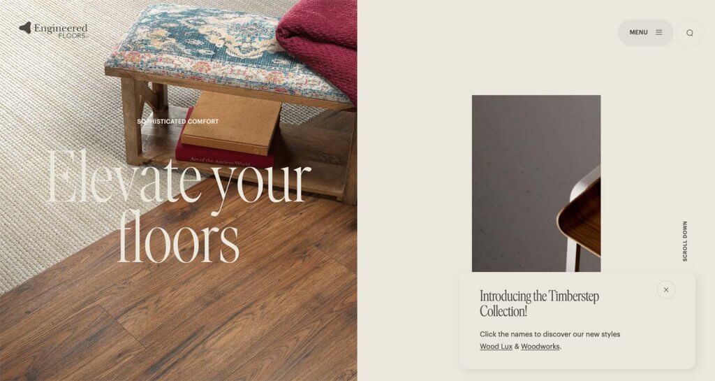
Split screen design is elegant and offers a lot of opportunity for the website designer. You can use multiple elements to create a unified design without feeling cluttered or like there’s too much happening on the screen.
The most effective split-screen designs often feature elements of different weights but equally important such as the example above.
The image on the left is weighty and provides a good look at what the website is about. The “screen” on the right has a simple background color, smaller image, and information to carry the user deeper into the website. It’s an effective way to get a lot of information on the homepage without scrolling.
5. Interesting E-commerce
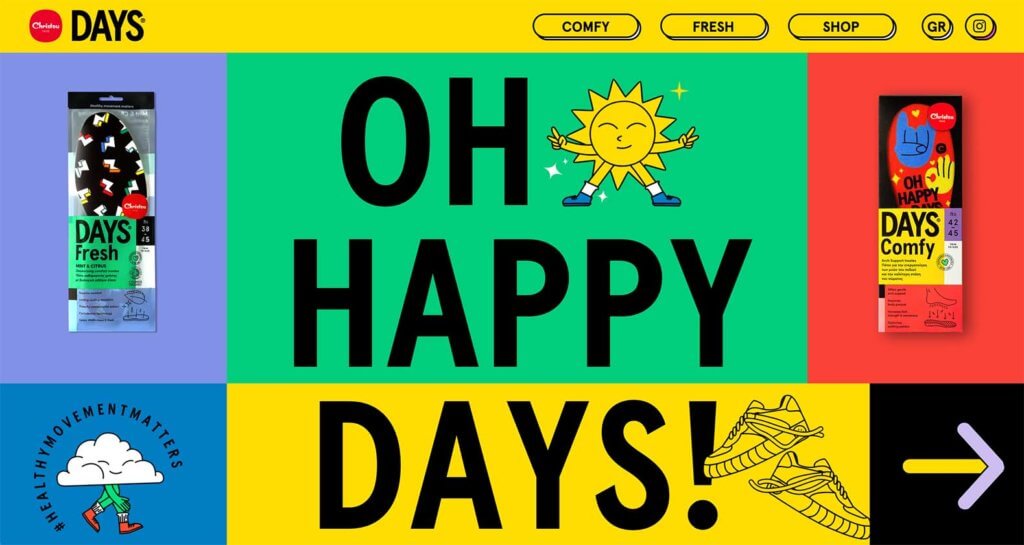
Who said e-commerce has to be boring?
If you have a smaller online store built on WordPress, experiment with different visual elements to break the pattern of the same old shopping experience.
Bright color, product slide-ins, and overside text make you want to know more about the featured item. Another interesting element of this e-commerce design is the navigation – it notes product features as added emphasis to promote sales.
Putting it All Together
WordPress website design trends can range from simple touches that you can add to almost any site to full-scale redesigns. Before you jump into a trend, think about the practical application for your message or brand.
Need a better set of page-building tools to give you more web design power? Check out Kadence Blocks!
Join us for the next Solid Academy Webinar!
Free weekly webinars that will help you master WordPress and increase your business's bottom line.
What is a WordPress Phishing Attack?
Learn how to identify and prevent phishing attacks on WordPress websites.
Kiki SheldonWebsite Protection: 5 Ways to Keep Your Website Safe
Robust website protection is the shield that stands between your business and relentless cyber attacks. Prioritizing website protection enables businesses to fortify defenses to safeguard their online presence and preserve the trust of their customers in the face of ever-evolving cybersecurity threats.
Kiki Sheldon23 Ideas To Grow Your WordPress Business in 2023
WordPress is the most popular website-building platform worldwide, trusted by numerous brands. WordPress enables you to build a user-friendly and highly reliable site, together with tools and plugins to enhance your marketing and work like a lead magnet. All these features make WordPress the platform chosen by more than 43% of businesses globally.
SolidWP Editorial TeamSign up now — Get SolidWP updates and valuable content straight to your inbox
Sign up
Get started with confidence — risk free, guaranteed

