WordPress Gutenberg Block Plugins: Comparing Stackable, Atomic Blocks and Otter Blocks
In this post, we’re going to be looking at three different WordPress Gutenberg block plugins that add additional blocks to the Gutenberg WordPress Editor. We’ll be looking at Stackable, Atomic Blocks and Otter Blocks. Each of these plugins has a number of different blocks they add, so today we’re just going to focus on the blocks they share in common and compare them.

The Accordion Blocks
First, we’ll take a look at the different accordion blocks. Each of these plugins has their own menu in the Gutenberg block menu. To add the Stackable accordion, open the Stackable menu and click on the accordion option.
This adds one accordion area where you can add the title for that accordion section and then add the details in the box below. If you want to add more accordion items, you’ll add another of the same block.
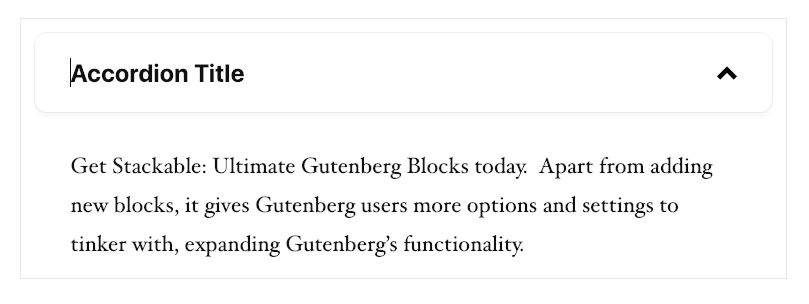
Your settings for the Stackable accordion block include the heading text and background colors and whether or not to have the accordion open at the start.
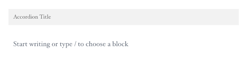
For the Atomic Accordion block, you’ll go into the Atomic menu and select the accordion block. In the highlighted area, you can put the section title with the information in the box below. Like Stackable, to add another accordion item, you need to add another accordion block. The settings for your Atomic Accordion include the font size and whether or not to have the accordion open by default.
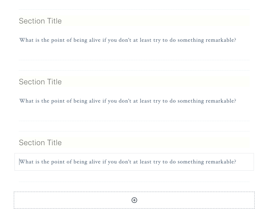
Like the other two, to add an Otter Accordion block, you’ll go into the Otter blocks menu and select the accordion block. Unlike the other two plugins, the Otter Blocks accordion starts out with three premade sections where you can enter your title and content. And, to add another accordion section, you’ll just click the plus sign at the bottom of the block. For your settings, you can determine your font size and whether or not to have a drop cap. You also have color settings for both the background and the text.
The Post Grid Blocks
The Stackable Posts block automatically displays your posts in a grid in your content. You can select your design between basic and list. In the post settings, you can determine how the posts are ordered, which category of posts to display, the number of posts to show and the number of columns to put the posts in. You can also decide whether or not to show the post title, featured image, excerpt, category, date, author, comments and the continue reading link. If you opt for the Featured Image to display, you can select which image shape you want to use and, if you enable the Display Continue Reading Link, you can create your won custom Read More Link.
The Atomic Post Grid block is very similar. You can determine the order the posts are displayed in, the category to pull posts from, the number of posts and columns. You can also decide whether or not to show the featured image, author, date, excerpt and Continue Reading Link. Again, you can determine the image style for your featured image and create a custom read more link if you have enabled these options.
While I’m overall very impressed with the Otter Blocks plugin, they’ve let me down a little here. Whenever I try to add this block to my content, I get an error. Now it does add the posts to the frontend, but if there are any settings you can adjust, I haven’t been able to access them so far in my testing.
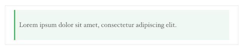
The Notification Blocks
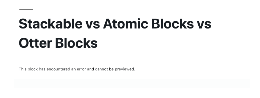
The Stackable notification block adds a large colored box to your content to notify your readers of any important information. There are different notification types, each with a different background color. However, if you’d like, you can also customize your background and text colors yourself. You can also make the notification dismissible.
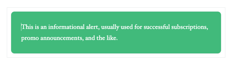
The Atomic Blocks notification block is called Notice. The title area of the notification has a background color which you can adjust. You can also adjust your font size and whether or not the notice should always be displayed.
The Otter Blocks notification block is also called Notice. Instead of having a title and content section, all the text is together. You can select between four different styles which change the color of the notice.
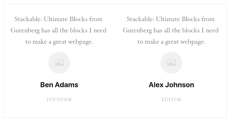
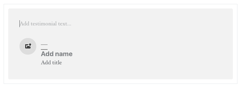
The Testimonial Blocks
The Stackable Testimonials block generates a block with two columns where you can add the testimonial and the person’s photo, name and position. In the settings, you can adjust the number of columns and the color of the body text, title and position.
The Atomic blocks Testimonial option is very similar to Stackable’s but only has one column. You can adjust the font size, the cite alignment (so their name, title and image) and the background and text colors.
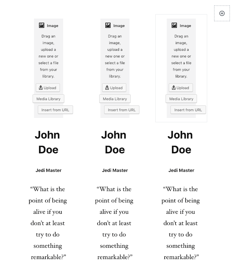
The Otter blocks Testimonial block starts with 3 columns where you can add an image, add the person’s name, title and then their quote. To add another column, there is a plus sign to the right of your original 3 columns. You can change the background color of the entire block or each individual testimonial column.
The Profile Blocks
The last blocks we’re going to look at are the Profile blocks. Technically, these aren’t all “profile” blocks but they’re fairly similar and I thought they were worth looking at.
Stackable has two blocks like this. The first is called Team Member. It adds two columns with spots for images, the person’s name, their title and a description. You can adjust the image shape and the number of columns along with the color settings.
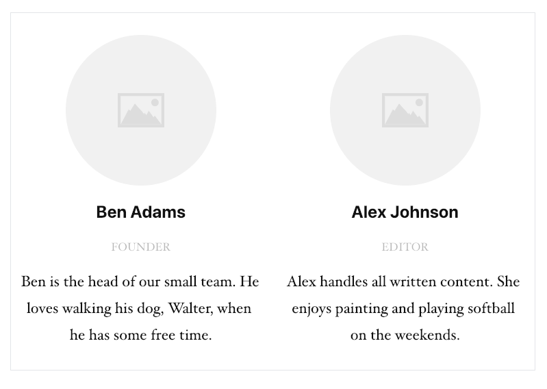
They also have a Card block which is pretty similar but is only one column and it includes a button you’d add a link to.
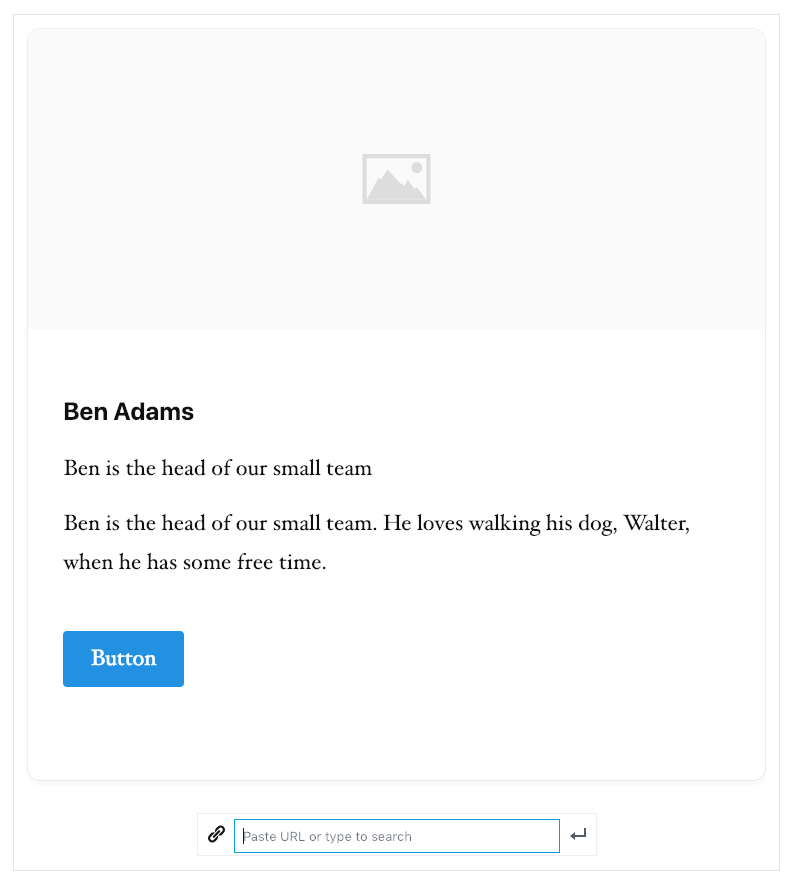
In the Atomic blocks plugin, this is called the Profile Box. You can add a photo, name, title and the description. You can change your font size, the image shape and your colors. And you can even add links to their social media and they will be added to the bottom of the profile box.
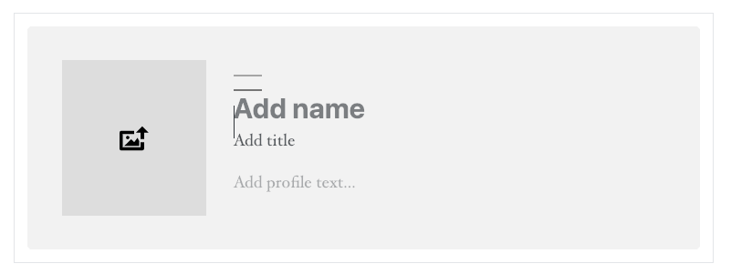
In Otter blocks, this particular block is the About the Author block. This block pulls all the information in from their profile on your site. It uses their “display” name, image and the bio they’ve added there. There are no settings for this block.
Each of these plugins has their own great features beyond the ones they all share that we’ve covered.
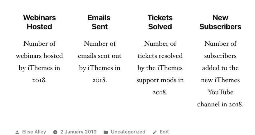
Of all the unique blocks in each plugin, I picked one from each plugin to review a little further.Stackable Count Up Block
The Count Up block in Stackable allows you to create columns counting up statistics. In the settings for this block, you can select your style, the number of columns and your color settings.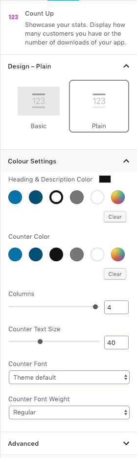 My favorite part of this block, though, is that it numbers actually “count up” on page load.
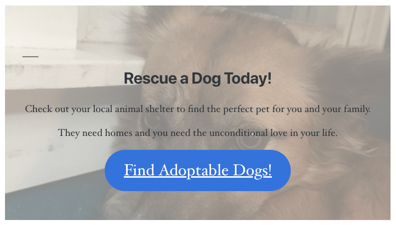
Atomic Blocks Call to Action Block
The Call to Action block in Atomic Blocks allows you to invite your users to action.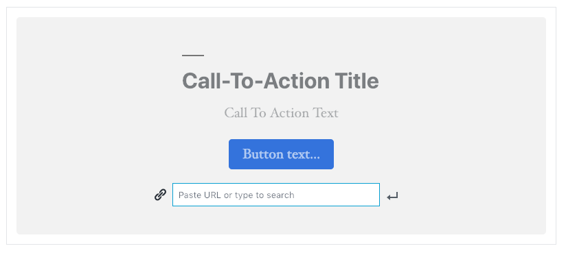 The Call to Action block has the usual settings like text and button styling. But one of my favorite settings for this block is the background image. They make it really easy for you to add an image to the background without having to create your own custom code or styling.
 You can see all the blocks included in each plugin in the chart below.
Otter Blocks Our Services Block
The Otter Blocks Our Services block helps you to easily create a chart to show customers the services you offer. One of the great features in this block is their use of the Font Awesome icons.
In the settings for the Our Services block, you’ll find the Icon settings where you can search for and select the icon you’d like to use.
One of the great features in this block is their use of the Font Awesome icons.
In the settings for the Our Services block, you’ll find the Icon settings where you can search for and select the icon you’d like to use.
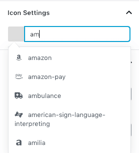 You can see all the available Font Awesome icons here.
To see all of the blocks available in each plugin, check out the chart below.
| Blocks | Stackable | Atomic Blocks | Otter Blocks |
|---|---|---|---|
| Call to Action | X | X | |
| Container | X | X | |
| Count Up | X | ||
| Video Popup | X | ||
| Accordion | X | X | X |
| Blockquote | X | ||
| Posts/Post Grid | X | X | X |
| Button | X | X | |
| Card | X | ||
| Divider | X | ||
| Expand/Show More | X | ||
| Feature Grid | X | ||
| Feature | X | ||
| Header | X | ||
| Icon List/Font Awesome Icons | X | X | |
| Image Box | X | ||
| Notification/Notice | X | X | X |
| Number Box | X | X | |
| Pricing Box/Pricing Table | X | X | |
| Pullquote | X | ||
| Spacer | X | X | |
| Team Member/Profile Box/About Author | X | X | X |
| Testimonial | X | X | X |
| Drop Cap | X | ||
| Sharing/Sharing Icons | X | X | |
| Click to Tweet | X | ||
| Pie Chart | X | ||
| Google Map | X | ||
| Plugin Card | X | ||
| Our Services | X |
Have you seen other great plugins like these three? Share them with us in the comments!
Join us for the next Solid Academy Webinar!
Free weekly webinars that will help you master WordPress and increase your business's bottom line.
What is a WordPress Phishing Attack?
Learn how to identify and prevent phishing attacks on WordPress websites.
Kiki SheldonWebsite Protection: 5 Ways to Keep Your Website Safe
Robust website protection is the shield that stands between your business and relentless cyber attacks. Prioritizing website protection enables businesses to fortify defenses to safeguard their online presence and preserve the trust of their customers in the face of ever-evolving cybersecurity threats.
Kiki Sheldon23 Ideas To Grow Your WordPress Business in 2023
WordPress is the most popular website-building platform worldwide, trusted by numerous brands. WordPress enables you to build a user-friendly and highly reliable site, together with tools and plugins to enhance your marketing and work like a lead magnet. All these features make WordPress the platform chosen by more than 43% of businesses globally.
SolidWP Editorial TeamSign up now — Get SolidWP updates and valuable content straight to your inbox
Sign up
Get started with confidence — risk free, guaranteed


